About This Digital iDarkroom Primer

This Primer on the new digital darkroom is provided on this blog to arm new DSLR photographers with the fundamental knowledge needed to become familiar with the evolving digital technologies and be able to apply them to their emerging interest in the photographic art. To read this Primer in logical order, please begin with the oldest post and read to the most current. Click HERE for Table of Contents.

Along the way, you'll find, photography tips, photography techniques and an ample dose of solid photo basics to help you feel comfortable in your digital darkroom.

A sister site, Hub's Camera, covers the fundamental mechanics of using your new DSLR camera. Then visit Hub's Photography Tips for basic but essential tips on all things photographic. Links to both of these sites can be found in the right-hand column of this page. Happy shooting!

"Hub's iDarkroom" is a non-commercial, educational service of Hubbard Camera LLC.

Friday, July 31, 2009

See Hub's Images They Way They Were Intended - In Print


I'm frequently asked if the images I use in my educational blogs and live classes can be purchased. I have resisted selling my images because I was concerned about affordability. I print all my images. Consequently each print is expensive, exacting and intended to meet the standards of a gallery print. As a result, the cost of prints might be out of reach for the readers I attempt to help in my digital photography blogs.

I recently discovered a solution that makes it possible to provide an economical way for students to see my images in a larger print form and also allow the modest collector a convenient way of purchasing fine art prints. The result is a professionally printed catalog, Hub's Imagery - By Popular Demand, containing enlarged versions of 21 of my most often requested and favorite images. The catalog cost less than $20. For those interested in owning any of my fine art images, the catalog also contains details for ordering individual prints on-line.

If you are interested in learning more, seeing a catalog preview or ordering the catalog, click here. I hope you will enjoy this series of images as much as I enjoyed putting the catalog together.

Sunday, June 7, 2009

Part 24b - White Balancing in the iDarkroom

In Part 24a - White Balancing in the iDarkroom, the concepts of "neutrality" in color and "known reference" were explained. Pretty exciting stuff. Right? If you have not read Part 24a, take the time now. It will make this discussion much easier to follow and understand.

Using these concepts, it's possible to apply white balancing in the iDarkroom to control precisely the color rendition of any image. Precise color in photographic terms means that colors in the print or on the monitor appear just as they would if seen under standard sunlight conditions.

In terms of "neutrality", when a true gray object is viewed under normal sunlit conditions, the individual Red, Green and Blue values are identical. If they are not the same, then the gray object exhibits a color bias or "tint". The object of white balancing is to adjust the individual RGB color values of the known neutral reference until all three colors have the same numeric values -- a true gray.

When we allow the computer to adjust a "known reference" to its neutral values, our imaging software can automatically apply this same numeric color correction to every pixel in the image. Like magic, the entire image becomes color balanced based on one "known reference".

But there are almost "known references" and then there are real "known references". This would be a good time for some examples and some helpful pictures.

(Blog pictures can appear small. Clicking on any of the following images will produce a larger version to save your eyesight.)

An "almost" known reference


Figure 1 - Camera white balance set to daylight, light source incandescent table lamp

The Figure 1 image was taken with a DSLR set on a white balance of "daylight". However, the light source was a table lamp using a standard incandescent light bulb. The result is a picture containing far too much yellow. We'll correct the color rendition in post processing using both Photoshop and Lightroom 2. But to make the needed correction, a "known reference" point is required. A point in this picture where we know the color should be a true neutral (where the red, green and blue values are equal).

We learned in Part 24a that all true shades of gray from pitch black to pure white have red, green and blue values that are equal. Our first task is to find a neutral color in this picture. This is tough, but there is one small area that appears to be a very bright white.


Figure 2 -- "Almost" known reference shown in yellow circle

The small area of the decorative ball shown in the yellow circle of Figure 2 appears to be made of white thread. That's a good thing. Photoshop can use this as a reference point. And here's how.


Figure 3 -- Using Photoshop's "Levels" command to adjust white balance.

Figure 3 shows our picture in Photoshop with the "Levels" command window open. Below the "Options" button are 3 eyedropper icons. These are the tools for color balancing. The three droppers from left to right are black, gray and white. The dropper selected is determined by the area chosen as the known reference. In this case, I selected the white eye dropper (inside the green circle) because I will be applying the color correction adjustment to a known white reference point in the picture.

I click on the white eye dropper to select it. Then I click on my known white reference (the white thread inside the red circle in Figure 3). Zap. It's done. Not only was my white reference point corrected to a neutral white, but every other pixel that makes up this image was automatically adjusted with the same color correction. Compare the color in Figures 2 and 3. Lightroom has a similar "eye dropper" white balance tool.

So that's it? If only it were that simple.

Remember, I said this is an "almost" known reference example. It works, and I use it frequently. It's a "good enough" solution for most situations. But, it is not an exact white balance color correction.

The reason is because the thread in this picture -- like every other color that we perceive as neutral -- isn't exactly neutral. If we could analyze the color of the thread that was used as our white balance reference point, it would not be a true neutral white. It would have some color bias (or tint). So, when I corrected the thread to a true neutral white with the "eye dropper" tool, I forced it to become a white that wasn't true to the real world color of the thread. For many, this is good enough.

A "Real" known reference

When color rendition is critical, there is a simple solution. A solution that has been used by photographers for decades. PLACE A KNOWN REFERENCE IN THE PICTURE.


Figure 4 - Kodak Color Control Patches Chart

All we need is something we can place in the frame of the picture that we know is absolutely accurate in color. Figure 4 shows one of these standards. This Kodak Color Control Patch chart contains colors of known color values. The black, gray and white on this chart are totally neutral. They are our "known references". If we could "eye dropper" one of these colors in Photoshop or Lightroom, then correct white balance would be assured.


Figure 5 - Original picture with Kodak reference chart included

Figure 5 shows the original picture again. Only this time the Kodak chart has been added to the scene. (I know. Having the chart in the picture isn't something most people would want to frame and hang in their living rooms. I'll take care of that issue later.) But the picture now contains a white that we know is truly white in reality.

Note: The Kodak chart shown here is only one type of reference that can be bought at your local camera shop. Many photographers use a commercially produced gray card. This 8 inch by 10 inch card is a single solid 18% gray in color on one side and pure white on the other side. For white balancing, either type of card works well. Remember to use the appropriate "eye dropper" tool when white balancing in Photoshop.

However, one complicating factor to our white balancing process by using this reference card is that WE DON'T WANT THE CARD TO APPEAR IN OUR FINAL PICTURE. So, when taking the picture in Figure 5, take a second picture with the reference card REMOVED. The plan is to correct the picture with the reference card to a perfect white balance, and THEN apply the same correction to our second picture with the card removed. But, how is this done?


Figure 6 - Create a "Levels" adjustment layer

Once the picture with the reference card is opened in Photoshop, create a new "levels" adjustment layer as shown in Figure 6.


Figure 7 - Making the white balance correction using a "levels" adjustment layer

Figure 7 shows how this white balance correction is made.
  • from the "layers" window (green box) select the new adjustment layer (yellow box);
  • from the "adjustments" window (blue box), select the white "eye dropper" (magenta box);
  • click the "eye dropper" on the white patch of the Kodak reference chart in the picture (red circle).
The entire picture changes in color to reflect the correction needed to make the white Kodak patch a true white. Now we have a picture of the decorative balls with a Kodak reference chart that is color accurate and suitable for framing.


Figure 8 - Applying white balance correction to the final picture

Figure 8 shows how the corrections we just made can be applied to the picture with the Kodak chart removed. After all, this second picture should require exactly the same correction.
  • Start by opening both pictures in Photoshop and place them side-by-side.
  • Make the active window the corrected picture containing the Kodak chart (the green box shows that this is the active window).
  • The layers window (I placed it between the two pictures for this example.) shows two layers. One called "background", and one labeled "levels 1". Click and hold on the "levels 1" layer.
  • Drag the "level 1" layers (shown as the red box above) to the second picture (without the Kodak chart) and release the mouse button.
  • Photoshop will automatically make a copy of the adjustment layer from the first picture and create an exact adjustment layer in the second picture. And the color will change to match our first, white balance corrected picture.

Figure 9 -- Final "real" known reference" white balanced image


Compare the final picture in Figure 3 using the "almost" known reference to the final "real" known reference picture in Figure 9 above.

Lightroom uses a similar "eye dropper" technique, but requires fewer steps.


Figure 10 -- Lightroom 2 White Balance Tool

White balancing is done in the Develop module of Lightroom 2.
  • click once on Lightroom's white balance "eye dropper" tool (red circle in Figure 10);
  • find the known neutral reference point in the picture and click once (shown in the green circle of Figure 10).
Then all colors within the picture will change based on the correction required to make the reference point neutral. Figure 11, below, shows the results of this white balance procedure.


Figure 11 - Original image after applying the white balance tool

Applying this correction to the picture without the reference chart is even easier. As a matter of fact, this correction can be applied to multiple pictures at the same time in one quick step.


Figure 12 - Applying one correction to multiple images in Lightroom

In the Library mode, shown above in Figure 12:
  • click-select the picture that has the correction you want to apply to other pictures in the collection (shown in the green box);
  • while holding down the Alt key on PCs or the Command key on Macs, click-select all the images to which you want to apply the same white balance correction as the original;
  • click on the "Synch Settings" button (shown in red circle in Figure 12).

The window below will appear:


Figure 13 - Lightroom "Synchronize Settings" window

The window that appears (Figure 13) allows the synchronization of dozens of image attributes. But only the white balance correction will be selected for this example. Only the White Balance box (shown in green) should contain a check mark -- all others blank. Then click on the Synchronize button in the lower right-hand corner.


Figure 14 - White Balance of master image is applied to all selected images.

Figure 14 shows the results of synchronizing the white balance of the four images. Lightroom's Synchronize feature allows for rapid duplication of any of the program's editing features to other pictures in the collection.

Note: Applying a white balance correction to multiple images ONLY works when all the pictures were taken under the SAME light source.

Considering the wealth of white balance controls available on modern DSLRs when the picture is being taken and the additional controls available in image editing software during post processing, there is little excuse remaining for poor color accuracy. Take advantage of all these controls to provide the color accuracy and creativity your vision of the final picture requires.

Tuesday, May 12, 2009

Part 24a - White Balancing in the iDarkroom

In my blog for beginning DSLR camera users, Hub's Camera, the topic of setting the proper white balance was the subject of a three part post (Parts 24a, 24b and 24c). It is also possible to correct an image's white balance in the digital darkroom after the picture has been taken. Regardless of whether you decide to address the issue of white balance when taking the picture or later in your computer as a "post processing" procedure, white balance is critical to the accurate rendition of colors in the final picture.


Figure 1, A classic white balance situation

Figure 1 illustrates the white balance problem faced by photographers in different light source situations. The image on top was taken with the camera set to "daylight" white balance. The colors in this picture have a definite yellow and red cast. This result is to be expected since the predominant light source for this picture was a table lamp with a standard tungsten light bulb.

The lower picture in Figure 1 appears more "normal" to our eyes. The whites are white. The blacks are black. And all the other colors are very close to the originals. To accomplish correct color rendering, the camera was set to a white balance of "tungsten". With the white balance settings on "tungsten", the camera automatically applied adjustments to make the final image look "normal" -- as it would appear under natural sunlight conditions.

So, that works pretty well. But what about the times when:
  • a photographer forgets to change the white balance settings in the camera, or
  • the available light source isn't quite a match for any of the camera's built-in white balance controls, or
  • the photographer needs to further refine the white balance of an image for precise color rendition?
Is there no hope? Sure there is. That's when you step in with your newly-acquired iDarkoom skills.

This is the first of a two-part discussion on White Balancing a picture after it has been taken using a digital imaging program. I will present the underlying principles that determine proper light balance. Understanding white balance requires an understanding of neutrality and a known point of reference. Sounds technical, but it's really common sense explained using a little technical background information.

Photography is a Red, Green and Blue world -- the world of primary colors. Using these primary colors we can reproduce all the colors we see in the real world every day. We can accomplish this because digital photography allows us to control the amount of red, green and blue that makes up each and every point of color in our final pictures. Every point of color in a picture is expressed as a specific amount of red, green and blue, in increments up to 256 for each color.

To illustrate this concept, hit the play button on the video screen below.


Figure 2 - RGB video

I know. I know. I'm no James Earl Jones. But I hope the information shown in the Figure 2 video helps you understand how all the colors of the rainbow can be re-created in photography by using only three primaries -- red, green and blue.


Figure 3 - Neutral Gray numeric values

Most importantly for our discussion of white balance correction, let's look at the concept of a "neutral" gray. A neutral gray has no color bias. A true neutral gray of any density contains numerically equal amounts of red, green and blue as shown in the Info screen in Figure 3.

Why is neutral gray so important? Glad you asked. In reality, there are few colors in a real photograph that we can identify by their RGB numeric values. Agree? When you take a picture of a red flower, do you absolutely know the R, G and B numeric values of that flower's red coloring? No. It's impossible without carrying around a scientific color measuring device in your camera bag. Let's not do that.

There is a component within a picture about which we do know some facts that will allow you to correctly color balance your image. That's the colors black, white and all the grays in between. We KNOW that if these "colors" are reproduced accurately then the Red, Green and Blue numeric components will be identical. If you can identify a white or gray in a picture, you have found a "known reference". That's a point of reference that can be used to white balance your picture and render the final image as it would appear under normal daylight lighting.

Then all we have to do is apply photography's best kept secret. If you can correct that shade of gray to a true neutral (where RGB values are identical) and change ALL remaining colors by the same amount, every color in the picture will be rendered correctly. Remember: When you identify a "known reference" and adjust that one color (gray) to neutral, then all the other colors will look correct.

Part 24b will discuss the tools that software programs like Photoshop and Lightroom 2 provide to make this critical white balance correction. You've already done the hard work by working your way through this post. The actual adjustments you will learn in Part 24b are easy.

Saturday, April 18, 2009

Part 23 - Creating a Copyright Notice

With so many images being displayed and shared on the Internet, theft is a major concern of photographers. The concern is justified. Photographers' images are innocently or deliberately stolen thousands of times everyday in cyberspace. One method of making theft less attractive and more difficult is the application of a copyright mark to monitor-displayed and printed images.

This blog post will provide you with an easy method of creating and applying simple copyright marks to your images.

Before beginning, there is one fact that every photographer must face. If you place an image on the Internet and someone wants to steal the picture, it WILL be stolen -- no matter what copyright precautions have been taken. The only guaranteed way of protecting your images from Internet theft is to NOT place them on the Internet.

The first step in producing a copyright mark is to create a blank image in your digital imaging software program. (For this exercise, Photoshop will be used. Other imaging programs will work in a similar fashion.) We are making a master copyright image that will be used every time a copyright mark is applied to a new photograph. This document is being created with a BLACK background at 600 ppi by 800 ppi at a resolution of 72 ppi for display on the Internet.

On this blank image, the TEXT tool will be used to create a new layer that contains the content of our copyright.

Figure 1. Text applied in separate layer

In Figure 1, WHITE text for the copyright has been added to a new layer above the black background. The placement and exact size of the text is not important at this time. Pick a text size that you can easily see and edit. Final sizing and positioning will be determined when the copyright is applied to the final image. Save this file with a unique name and in a permanent safe location. Make certain you save this file with the layers intact. In Photoshop jargon, this means don't flatten the image, and save it as a TIFF or PSD file. You will use this copyright master file frequently.

While we're at it, let's produce another master file using black text on a white background. This will give us two color options for our copyright mark -- white text to be used on dark backgrounds and black text for light picture backgrounds.

Figure 2. Adding black copyright text to a white background master.

Follow the same steps shown above, but this time make the background white and the text color black. The finished digital image is seen in Figure 2. Save this file with a descriptive title.

It's time to add this copyright to a priceless Hub original.

Figure 3. Original picture and copyright files open.

Figure 3 shows the Photoshop workspace with the image requiring the copyright mark on the left and our prepared copyright text image on the right. On the far right is the "layers" window. Begin by clicking on the copyright image to make it the active window (outline in yellow above). Notice the "layers" window indicates two layers -- background layer and the text layer outlined in red.

Figure 4. Moving the copyright layer to the new image.

Now for the fun part. Click and hold on the layer containing the copyright TEXT. While holding the mouse button down, drag the text layer to the picture on the left in Figure 4.

Figure 5. Text layer applied to original photograph.

The original photograph will now look like Figure 5 with the copyright text now applied as a new layer above the image. It worked. But it's not in a very aesthetic position on the picture.

Figure 6. Final copyright placement.

Using the "move" tool (shown in the red circle in Figure 6) and the text layer selected, the copyright can be moved (dragged) to its final location on the picture. The white text copyright mark was selected for this picture to stand out against the gray background.

Figure 7. Scaling the text to the picture.

Using the "Scale image" function in Photoshop and the text layer selected, the text size can be altered to suit the photographer's taste. (see Figure 7) This copyright will suffice, but I find it visually distracting. I prefer a semi-transparent watermark to allow the background image to be seen.

Figure 8. Changing the copyright text transparency.

In Figure 8, the copyright text layer has been selected. The "opacity" control above the text layer has been changed to 50% to allow the background image to be seen through the white text.

Figure 9. Final image with copyright as it would appear on the internet.

Figure 9 shows the final Internet-ready image. Figure 10 (below) used the same procedure to apply the black copyright text to a light background image. Notice that a 50% transparency has also been applied to this text.

Figure 10. Black text copyright notice on a light colored background.

Both of these images required "flattening" of the layers and saving as JPEG files for Internet use.

Some final notes:
  • Be careful not to overwrite your original image file. Save this file under a new name.
  • Once the master copyright files have been created and saved, applying the notice to your images in the future will require only a few seconds of your time.
  • When sizing your copyright text on the final picture, keep it unobtrusive.
  • The metadata that's attached to your original file will provide additional proof of your ownership.
  • This example is intended specifically for 72 ppi images used on the Internet. I also add a copyright mark to images I print. Since I normally print at 240 ppi, I have created a white and a black text master copyright file for this ppi. I then apply my copyright notice to these print images using the same steps as above.

Monday, March 16, 2009

Part 22 - Preserving Your Digital Image Files

It has been said that today's digital image files may have a shorter life expectancy than traditional film due to the limitations of digital storage technology. For example, the negatives from the black & white or color film your dad took of you as a child will probably out live the CD you just created for back up. As you become more accomplished in photography and the iDarkroom, the inevitable result will be an ever increasing number of priceless files that make up your personal collection. To you and your family, these files are irreplaceable.

There is an organization that provides the public with the latest information in storage technology. The International Imaging Industry Association, I3A, is the leading imaging industry trade association. Its members are experts in setting standards, providing education, and supporting safe environmental practices for the photographic and mobile imaging markets. The goal of I3A is to find common ground for advancing the industry, and to enable better products and services for its customers.

On the I3A's educational website, SaveMyMemories.org, a step-by-step guide for archiving digital files using the latest available options is provided to the public. Bookmark this site. Use the information they provide to help you choose the best possible back up methodology to store your irreplaceable creative and family image files.

Then, from time to time, check back in to see what new long-term data storage technologies, products and recommendations have been introduced that might further increase the life expectancy of your images.

Sunday, February 1, 2009

Part 21 - Cloning

Without a doubt, it was the ability to "clone" that provided the initial boost to digital imaging popularity among professional photographers. In the early 1990s, digital imaging meant shooting traditional film and then scanning the negatives or slides to produce digital files that could be retouched in the first digital imaging systems. "Dust Busting", the elimination of dust, scratches and imperfections became the catch phrase of the 90s as well as the digital photo technician's primary tool for preparing images for publication.

Those early digital imaging systems were prohibitively expensive -- $100,000 and up. Today, sophisticated programs from Photoshop to basic Internet freeware/shareware imaging software make cloning and a wealth of other manipulation tools affordable and available to every digital photographer.

Basic cloning tools provide the ability to duplicate one area of an image and to exactly place the duplicate (clone) in another area of the same image. Today, most image editing programs include some form of cloning as a fundamental tool. This article will explore the basics of cloning that are common within today's imaging programs. Let's get started by viewing the brief introductory video below.


The Basics (click on Play button)

Below is the final example from this video and a summary of the topics covered:


  • Selecting the Clone tool
  • Hard/soft brush slider control
  • Brush size control
  • A simple clone example.
The cloning tool has evolved to become a very precise and sophisticated "copy and paste" tool for photographers.

Typical uses for this very flexible tool include:
  • duplicating picture elements within the same picture -- like the placement of the third water drop in the video above
  • eliminating imperfections
  • eliminating elements that distract from a photograph's composition.


Original unretouched image

The following video clip provides an example of eliminating imperfections in the informal portrait above.


Removing blemishes and imperfections (click on Play button)

Below are the enlarged "before and after" pictures from the video above:


Before retouching


After retouching with cloning tool

This video exercise demonstrates the basic cloning steps required to remove common imperfections and blemishes. Points to remember include:
  • Before attempting this type of retouching, enlarge the monitor image to 100% or greater.
  • Use a brush size that is close to the size of the object to be removed.
  • Set the brush hardness to 0% to provide a soft edge to the clone brush to allow the clone to blend smoothly into the surrounding image area.
  • The cloning source should match the tone, density and color of the area immediately surrounding the imperfection.
Most imaging programs containing cloning tools provide a method of stepping backward through the cloning steps. This capability affords us the luxury of making a mistake and easily stepping back in the process to try again. Remember: You have altered the original image during this process. Save this retouched file under a different name to preserve the original.

It's easy to see why photographers who specialize in people pictures find the clone tool so useful. In the past, a specially-trained retouching artist using brush and paints would have been called on to perform these corrections manually on the original negative or final print -- costly, time consuming and requiring considerable artistic skills.

The next example video clip uses the cloning tool to eliminate unwanted elements within the picture below.


Original image before clone retouching the green stem in the background


Click Play button to see video.


Same image after using clone tool to replace stem with additional background

To successfully "clone out" an element within a picture, here are the tips given in this video:
  • Enlarge the monitor image to 100% or more.
  • Use as large a brush as the surrounding picture elements will allow.
  • Don't clone a large area using a single source. Instead, use several sources to avoid establishing a pattern that can be detected by the viewer's eyes. Remember most patterns in nature are random.
Since the introduction of digital cloning, the process has grown to include an array of options giving the photographer more and increasingly sophisticated options. This article only covers the most basic common cloning features. As you expand your iDarkroom skills you will become familiar with all the options included in your imaging program's cloning tool.

The real secret to mastering cloning is practice. I know. I say practice often. But there is a knack to performing cloning in a manner that is truly invisible to the viewer. I'm definitely not an artist, but I'm pretty good at cloning. It's a knack that anyone can learn. It just takes practice. So, select a few of your images and force yourself to practice your cloning skills. You will eventually be amazed at what you and your mouse can do to improve your photographs.

Tuesday, December 16, 2008

Part 20 - Cropping Digital Images

Without a doubt, the first and most frequently used function in any digital imaging program is the Cropping Tool. Cropping has been basic to photography since its beginning.

Cropping determines the dimensions and boundaries of the final image. In addition, cropping ultimately determines the artistic and aesthetic placement of the central focus of any image.

Cropping occurs twice during the creation of a photograph:
  • The first crop is performed in the camera as the photographer composes the picture in the viewfinder. The photographer decides at this time the limits of the scene that will be contained within the 4 borders of the picture as well as the elements (objects) that will be captured.
  • The second crop takes place in the iDarkroom. Digital imaging programs contain cropping tools that allow the photographer to perform a final technical and artistic adjustment to define the dimensions and element contents of the final image.
A fundamental rule in photography is to crop in the camera. Photographers have long been advised to compose the image in the viewfinder as it is to appear in the final print. There are sound reasons for making this recommendation.
  • Aesthetically, cropping the image in the camera forces the serious photographer to focus on the rules of good composition and to mentally visualize the final image.
  • Technically, cropping in the camera produces a digital file that requires less cropping in the iDarkroom which interprets to sharper final prints. Excessive digital cropping and/or enlarging reduces the resolution and, consequently, the quality of the final photograph.
In the real world, photographers walk a fine line when they consider cropping. Yes, professional photographers will "pre-visualize" the final image and crop accordingly as they compose the picture in the field or studio. However, to provide some margin of error, most professional photographers will leave a small excess of the original scene on each of the four sides of the viewfinder image. The final cropping almost always takes place in the iDarkroom.

Because of the importance of cropping to photography, virtually every digital imaging program offers tools to perform this function. I will use cropping examples with Adobe's Lightroom and Photoshop. Most imaging programs will offer a tool with similar functionality.


Original picture as shot without iDarkroom cropping.

This is my sample picture for walking through Lightroom and Photoshop's cropping functions. To match the pre-visualized image of this outstanding photographer (me), some cropping refinement is required.


The area to be eliminated (or "cropped out") is shown in light brown.

Shown above is the same image with the areas to be eliminated shaded in brown. Notice: I am not concerned about the size of the final image at this stage. I am only concerned with the contents of the image appearing within the borders of the final print.


Cropping Screen with the Lightroom's Develop Module

Lightroom's cropping tool (red box above) is available from the program's Develop Module. Clicking on this tool reveals the window shown above. A free-hand cropping icon (shown in green) is available for a click-and-drag cropping. Or, handles that appear on each corner and the center of each side can be clicked-and-dragged to a new location. (Normally, I use the six handles to define the cropped area.)

An additional convenience provided in Lightroom is the inclusion of "rule of thirds" indicators. Faint grid lines that divide the picture into thirds horizontally and vertically are overlaid on the picture. The four intersections of these grid lines (shown in blue) are the "rule of thirds" points for subject placement. The locations of these points change dynamically as the crop (border lines) is moved -- nice touch for beginning and advanced photographers alike.


Lightroom's Develop Module with Crop Indicated

Here is a closer view of the Lightroom screen with the crop lines positioned. The image areas in dark gray will be eliminated (cropped) from the final digital picture. By pushing the "enter" key, the crop will be performed, and the final image appears.

Remember from our previous discussion about the non-destructive editing features of programs like Lightroom and Apple's Aperture, the original digital file is NOT being altered. The information about the crop just performed will be included along with any other corrections in a separate file and applied to this image whenever it is displayed on the monitor. The original uncropped and unaltered file is ALWAYS retrievable.

Let's compare this cropping technique to that used by Photoshop and many similar programs.


Photoshop's Crop Tool (in red)

In Photoshop, the cropping tool is always present on the left-hand tool bar as shown in the red circle above. This icon has become almost universal and looks similar in other editing programs. Clicking on this tool activates the cropping function.


The Photoshop crop is indicated and ready for execution

In the picture above, the crop tool (a click-and-drag functioning tool) has been positioned as indicated by the "marching ants" marque. After releasing the mouse button, the area to be "cropped out" will be shown in dark gray (above). Notice, much like Lightroom, that six positioning handles also appear when the mouse button is released (red circles above). Using these handles allows for final precision positioning of the borders of the crop. Hitting the "return" or "enter" key completes the cropping function.


Final cropped picture

Remember, Photoshop and similar editing programs work on a destructive editing process. In other words, the original file HAS been altered. So, perform a "SAVE AS" command and use a new file name NOW. This will ensure that the original file will NOT be overwritten and destroyed.

Simultaneous Cropping and Sizing

It is possible to perform cropping and image re-sizing at the same time with the cropping tool. Having this capability allows the photographer to specify the desired specific print size and print resolution while performing the cropping.


Original picture before cropping and re-sizing

This picture requires cropping to correctly position the subject. In addition, I know that a final print with the dimensions of 10" x 8" at 240 ppi is required. With Photoshop's cropping tool, I can perform both operations at once.


Photoshop's cropping and resizing functions

With the cropping tool selected (red circle above), I can type in specific dimensional attributes in the width, height and resolution boxes (shown within the green circles above). In this case, a width of 10", a height of 8" and a resolution of 240 ppi are typed into the boxes.

Caution: When you don't want to automatically re-size an image to specific dimensions or PPI resolution, these boxes must be blank. Using the "Clear" button (yellow circle above), will erase any specified sizing in the width, length and resolution boxes.


Areas to crop are shown in dark gray and the constrained 8"x10" print area is visible.

Now, as the click-and-drag is performed with the mouse, the crop is constrained to the proportions of 8"x10". Any crop can be accommodated when you perform this operation, as long as it conforms to the proportion of 8 by 10. The crop and re-sizing is completed by hitting the "return" or "enter" key.


Final cropped and re-sized image

Check the properties of this image and you will discover that the new cropped image is 8 inches by 10 inches with a resolution of 240 ppi. Remember to save this file under a new file name to prevent overwriting the original file. Most modern image editing programs incorporate this time-saving feature in their cropping tools.

You will find that the cropping tool is one of your best friends and most utilized tools. Because of the frequency of use, cropping will soon become second nature.

Thursday, November 27, 2008

Hub's iDarkroom Table of Contents

Sunday, November 16, 2008

Part 19 - Storing Digital Images

If there's a downside to your new found photographic passion, it's the fact that there's almost no limit to the number of pictures that can be taken. There's no film to buy. There are no film processing costs. And DSLR data storage cards can be used over and over to spread their cost over hundreds or thousands of pictures.

With almost no cost involved, today's DSLR photographers shoot more images than ever. Now the issue is the safe storage of files. Not only the data files from the camera's storage cards, but all the variations made from the files during post processing in image editing programs. Just one file might give birth to several more. Here's an example of the versions in the life of just one digital image:
  • The original camera file that was copied and saved to your computer's hard drive.
  • One file in the same size as the original file that has been edited, corrected and saved.
  • One file that was re-sized and saved for use on a website.
  • One file that was re-sized and saved to make an 8"x10" print for your den.
  • One file that was re-sized and saved to appear in a magazine or newspaper.
In this case, one original file generated the need to save 4 new files. Multiply this scenario for all your best images and you are soon experiencing a computer hard drive that's overflowing. Most disturbing is the vulnerability of these fragile and irreplaceable files. There are dozens of ways this data can be lost forever, like:
  • power surges
  • jarring or dropping a hard drive
  • virus attack corrupting the hard drive
  • computer being stolen
  • the hard drive wearing out over time from normal use
  • your 8-year old types "reformat"
  • alien computer abductions.
It's obvious some regular and "adhered to" back up process is necessary for image security and peace of mind. The Internet is filled with suggestions for backing up your images -- some good, some bad.

I will describe the procedure I use for backing up and storing my images. My method is not necessarily any better, but it has provided me with the confidence to know that my images are protected and always retrievable.

To start with, my primary imaging computer is an iMac. (No, that's not a recommendation, it's just the digital imaging computer I grew up with and am most comfortable using.) The current Mac OS has an automatic back up feature called Time Machine. I have a dedicated 750GB hard drive that is used by Time Machine to provide an HOURLY backup of my "changed" or new files.

I use the Time Machine feature as a secondary backup (sort of a "just in case" copy of my files). My primary back up device is a 1 terabyte Seagate external hard drive that stores an exact copy of my computer's hard drive that is created every morning at 2 a.m. using a backup program called SuperDuper. This primary back up drive is connected to my computer by Firewire (rather than USB) to provide faster copy speeds. If you have more than one computer or are part of a network, this "image-dedicated" back up drive can also be installed to allow back up over the network.


Seagate Free Agent, 1 Terabyte External Hard Drive

Here is the process I follow for uploading and protecting the files coming from my DSLR:
  1. Using Lightroom's import feature I transfer the files from my data card to a dedicated Lightroom image folder.
  2. I then make a second copy of the same files into a dedicated holding folder on my external terabyte hard drive.
  3. I then erase the original files from my data card for re-use.
  4. SuperDuper and Time Machine perform their timed back ups to ensure my original and edited images are backed up on two separate hard drives.
  5. Over time the Holding Folder on my terabyte drive grows in size. When the folder reaches 4 gigabytes, I copy the folder to a DVD for long term storage. The files in the Holding Folder are then erased in preparation for the next series of images. I am very careful to store my DVDs in a safe environment to maximize their life.
There is much dispute over the life expectancy of CDs and DVDs, but they are the best alternative available today. The better (and more expensive) DVDs do have a longer projected life expectancy. Since there's little likelihood that these DVDs will be needed on a regular basis, it's a good idea to consider storing them off-site (i.e. safety deposit box, under grandma's bed, etc.). If the worst ever happened and something catastrophic happened to your digital darkroom, your original image files would be safe.

In total, I have 4 copies of my original files and 3 copies of any new or altered versions I create from the original image files. Although my procedure isn't bullet proof, it does allow me to sleep better at night.

Not long ago, the expense of 750GB and 1 terabyte drives made this back up process financially prohibitive and other alternatives like storing images on Internet services were more attractive. However, the cost of large capacity hard drives has dropped dramatically and is within the reach of most photographers. Be sure to research and compare hard drives to determine the positives and negatives that real users are experiencing.

Finally, with the exception of Time Machine, these same procedures are adaptable to any PC platform and operating system.

Tuesday, November 11, 2008

Part 18 - Resizing Digital Images

Like an enlarger in a traditional darkroom, images can be re-sized in the digital iDarkroom to suit the requirements of the job. The computer replaces the enlarger, and a new set of tools as well as technical jargon are used to make these necessary image conversions. This article will provide the basic information required to re-size pictures to their required dimensions and resolution.

Adobe's Photoshop will be used as the editing tool, but the lessons learned here are applicable to nearly all image editing software. As you become more proficient with your own image editing software, you'll discover that there are several ways of re-sizing an image. But the most basic and most common method will be explained in this primer.


Photoshop workspace with original image, "Histogram" and "Image Size" window

The illustration above is a portion of Photoshop's workspace and shows the picture to be used in this article, the Histogram and the "Image Size" window. The picture is taken directly from the camera with no editing applied. For my purpose, this picture requires some cropping, image enhancement and resizing. It's these steps that will be walked through and discussed.

Accessing the Image Size tool in Photoshop is straightforward.


Accessing the Image Size Tool in Photoshop

To activate the Image Size tool in Photoshop, use the "Image" drop-down menu in the main bar and select "Image Size..." (shown above).


Close up of the "Image Size" window

Here's the Image Size window in a size that's actually legible. Most of the explanations and procedures in this re-sizing article require the use of this Image Size tool. The information initially presented in the Image Size window provides the current technical "size" details of the image as well as entry boxes for altering any dimensions.

The Pixel Dimensions section (red box) shows the size of the image in terms of pixels. In this case, the dimensions are of an image that came directly from the camera -- 3872 pixels wide by 2592 pixels high. The Document Size section (green box) indicates exactly how large the image would be if printed right now. In this case the measurement scale is set in inches. So a print from this image would measure 16.133 inches by 10.8 inches with a resolution of 240 pixels per inch. (Document Size is the measurement for the entire printable area -- not necessarily the size of the picture on the document. More on printable area in just a moment.)

My first editing task is to crop the image to include only the portion of the picture needed for the final print.


Cropping Tool in Photoshop can be seen as the marque lines in this screen picture

Use of the cropping function will be explained in later articles, but for this example notice the cropping marque lines (the marching ants as Adobe would say) that define where my cropping will occur. (I'm taking a little image area off each end of the picture.) With the crop area visually defined, hit ENTER. The crop is completed and appears on my monitor.


The new Image Size information after the crop was performed.

Remember the original size of this image was 16.133 inches by 10.8 inches. The new cropped size (seen above) is 14.917 inches by 10.8 inches. This new dimension reflects the fact that I cropped (approximately) one inch off the ends of the original picture. The crop function has also caused the overall file size to become smaller. The number next to the words "Pixel Dimensions" indicates the current file size. This cropped image reduced the file size from 57.4 megabytes to 53.1. What happened to the other 4.3 megabytes of image information? It was trashed.

Next I SAVE the image under a new name to avoid corrupting my original image file.

Then with a little Photoshop magic I apply the color, density, saturation, etc. adjustments needed to create a masterpiece. (These steps are not covered in this article.) When done making corrections, I again SAVE the file.


Cropped image with corrections applied as seen in Photoshop

That was easy. Now I need to re-size the image for its intended use. Some of the possible uses include:
  1. Producing a print from my printer
  2. Producing an image file for reproduction in a printed publication
  3. Producing an image file that can be used in a digital slide show or on the Internet.
Each of these possible uses has unique image size parameters. It's these parameters that determine the specifications entered into the Image Size window.

1. Resizing the photo for printing on your home printer

You'll see much debate on photo blogs and forums about the resolution (pixels per inch or PPI) required to make a good print in your iDarkoom. The recommendations range from 200 to 300 PPI. I know from my career at a major photo printer manufacturer that my printer works best at 240 PPI. Using a pixel per inch setting higher than 300 has little or no impact on the quality of the final print. So, when I set up an image for printing at home, 240 PPI is my target resolution.

All I need to know now is what size I want to make the print. For example's sake, let's size the existing 14.917 inches by 10.8 inches x 240 PPI to fit on a standard 8"x10" piece of photo paper with at least a 1/2 inch border for framing purposes.


Image sizing for an 8"x10" print

First, the Golden Rule for re-sizing operations: Reducing the physical dimensions or the resolution (PPI) of an image is OK. Enlarging any of these parameters will introduce some degree of quality and visual imperfections. More to come.

In the picture above, I have entered a new value for the width of this image -- 9 inches. The height of the image AUTOMATICALLY changed to the correct proportional value -- 6.516 inches. Why did the height change when I entered 9 inches for the width? Because I checked the box labeled "Constrain Proportions". This instruction tells Photoshop to keep all sides in proportion to the original image. This relationship is shown in the green box above by the lines and padlock icon. Change one height/width dimension, and the remaining dimension changes automatically to constrain the proportions.

Since I want the image to print at a resolution of 240 PPI, I do NOT want the original resolution of 240 PPI to change. I ensure this PPI is retained by CHECKING the RESAMPLE box shown in red. If I had not CHECKED this box the resolution would also have changed in proportion to the new 9" width dimension I entered. (With RESAMPLING off and since I technically made the picture smaller than the original, the PPI number would have automatically increased to reflect the smaller image size.)

If you're asking why the height dimension shown in the Document Size area is 6.516 and not 7 inches to give me a 9"x7" print on the 8"x10" piece of paper, then please read my article entitled "Proportions in Photography" on my Hub's Photography Tips blog site.

Clicking on OK completes this re-sizing operation. Then SAVE the image, and you're ready to print.

It's time to explain "printable area" and its relationship to Document Size. In the above example, the Document Size is the "printable area". Consequently, the pixel dimensions of the image and the Document Size are exactly the same. Document Size does NOT refer to the paper being used in the printer. It only refers to the size of the complete image that will be sent to the printer.

An example should help. Many photographers make the artistic decision to print their picture on paper larger than the image they are preparing. This layout can be accomplished in Photoshop by enlarging the entire "canvas" that the picture occupies.


Canvas Size Window in Photoshop

A function called Canvas Size under the Image pull-down menu activates the window shown above. Size values can be entered in the height and width boxes to increase the size of the canvas. It's important to remember that Canvas Size function doesn't enlarge the image. Instead it adds new canvas space AROUND the existing image.

Using the example picture, I want to print the original cropped file (14.917 inches by 10.8 inches) onto a 13"x19" piece of fine art paper. I also want to control exactly where on this large piece of paper my image will appear. To make this happen I:
  • enter the new canvas width and height information into the boxes (green oval),
  • instruct the computer to place my image in the center of this new canvas by clicking on the CENTER box in the Anchor selection section (blue oval), and
  • select "white" as the color of my canvas using the canvas extension color menu
Notice that the size of this file has now increased to 81.4 megabytes -- due to adding the extra white canvas area to the file.
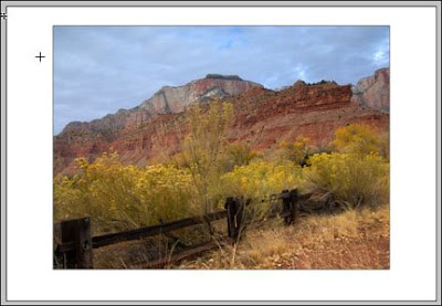

New 13"x19" Canvas

Now the monitor displays the original picture placed on a 13"x19 white canvas. The picture-only portion of the canvas was then moved upward on the canvas by one inch to give it the proper visual positioning for mounting.

One more time, open the Image Size window and the impact of changing the canvas size is apparent in the Document Size section.
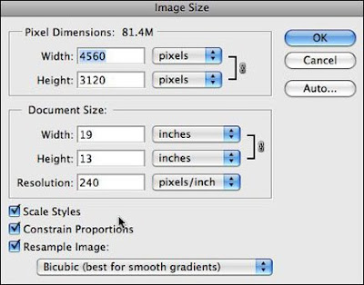

Image Size information after the canvas was enlarged

The new Document Size is 13"x19" even though we know that the image on the canvas is 14.917 inches by 10.8 inches. The entire 13"x19" canvas is the printable area and is reflected in the Document Size. In addition the Image Size window reports that the file size is now 81.4 megabytes. So, (in the Image Size window) Document Size equals the actual image size only when the Canvas Size equals the actual image size.

2. Producing an image file for reproduction in a printed publication

OK, National Geographic Magazine has called and wants to use this picture in an upcoming issue. Happens every day. Right.

The magazine's specifications require an image with a PPI of 300. I SAVED my initial cropped and corrected image file, and it is currently sized at 14.917 inches by 10.8 inches x 240 PPI.

All I need to do is re-size the image to National Geographic's specifications.


Resizing for magazine publication

Opening the "Image Size..." window, I can change the single variable -- Resolution -- in the Document Size/Resolution box (shown in green) to 300. This time, however, I UNCHECKED the RESAMPLE box (see above). Consequently all three dimensional attributes are LOCKED together and the width and height of the image AUTOMATICALLY change to remain in proportion to new 300 PPI entry. (11.933 inches by 8.64 inches) Clicking OK will complete the change. Then SAVE the altered file under a new name. (Impress others by including the words National Geographic in the new file name.)

When the photo editor at National Geographic receives this file, it will be given final sizing as it is placed in their digital publishing program. All that's left to do is cash the check.

3. Producing an image file that can be used in a digital slide show or on the Internet

All of the images I use for Hub's photo blogs must be resized to accommodate the specifications of my visitors' monitors. This means that I must place images into my blogs that have a PPI of 72. I also limit the height and width dimensions of these images to a maximum value of 6 inches for either side. So now I have my parameters, let's convert the same picture for use on this blog site.


Resizing for Internet or Monitor Slide Shows

The original images I produce for these blogs are always larger than the image that is ultimately placed on the blog page. To reduce the size of my images, I use the "Image Size..." tool as shown above. This example picture is horizontal (wider than it is tall). I enter "6" in the width box. Because the "Constrain Proportions" box is CHECKED, the Height dimension automatically changes to 4.344 inches. I've also CHECKED the RESAMPLE IMAGE box to allow me to enter a new PPI of 72 in the RESOLUTION box (inside the green oval).

Clicking OK completes the action and results in an image with the dimensions of 6 inches by 4.344 inches by 72 PPI. I SAVE this file under a new name, and it's ready to upload to my blog page.

Note: The Resizing Golden Rule states that enlarging a picture beyond its original dimensions and PPI constraints is to be avoided. As has been stated in earlier articles on this blog, making this type of enlargement involves interpolating the image. To make this happen Photoshop and all image editing programs must "make up" digital data. In other words, in order to provide enough pixels to comply with your enlargement request, the software must "guess" what the missing pixels would have been. Photoshop is pretty good at guessing, but it's still just a guess.

So if you must enlarge a picture larger than its technical specification, do it sparingly and keep the enlargement as small as possible. In practical terms, if the file out of your camera is capable of making a horizontal print that's say 12"x9" without any interpolation at 240 PPI, can you enlarge the picture to 14" wide with the same 240 PPI without noticeable quality loss? The anwer is YES. Can you make a print that's 24" wide? The answer is again YES. But at this more extreme enlargement size, you will see a quality difference. In fact, you can make this picture ANY size you want, but the more it's enlarged the more noticeable the imperfections caused by interpolation will become.

As I mentioned at the beginning of this article, there are several ways to re-size pictures using today's image editing programs. The method explained here will be used for the majority of your work and is common to most imaging software.

If you have questions or comments regarding this primer on re-sizing digital image files, please let me know.