Just when you think it's safe to go to your photo store and speak "printer-ese", another term and another decision shakes your confidence. Do I buy a printer that uses "dye-based" inks or "pigment-based" inks?
The choice you make does have a significant impact on your image making. Like everything else in photography, there are trade-offs to consider. This post is intended to explain the basic differences between these two ink types and make it easier for you to make your printer purchase.
Background
Dye-based inks have been around in the inkjet printer marketplace since the beginning. The dyes used to produce this ink are derived from vegetable matter that contains the desired color, or they are produced synthetically in the lab. Just as Indians would produce paints from the extracts of plants to add color to fabric, so do modern color scientists develop dyes used to manufacture their inkjet inks.
Dye ink has a clear cut set of advantages:
- The size of the color particle is very small and easily dissolved in solution.
- The particle size is small enough to penetrate any printing paper.
- The colors are generally numerous, bright and colorful to provide a broad color range.
- Because these dyes are absorbed into the printing paper, they provide excellent glossy prints.
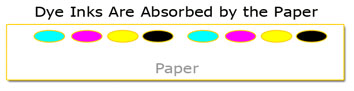
Dye inks also have a list of photographic disadvantages:
- Prints made with dye inks have a shorter life expectancy.
- Bleeding is a concern (bleeding occurs as a drop of dye ink falls on a piece of paper and begins to expand in size or spread out as the drop is absorbed into the paper).
- Dye inks are NOT water resistant (much like watercolors in the painting world).
But for many years, dye inks have been the industry standard and have been a major contributor in raising digital photography to an art form.
Pigment inks have been a serious alternative to dye inks for nearly a decade now. Unlike dye inks, pigment inks are derived from ground up minerals. The resulting sizes of the pigment particles are 50 to 250 times larger than dye particles. Although relatively new to the inkjet scene, pigment inks/paints have been used for centuries in the world of art.
As you probably have guessed, there is a list of advantages that pigment inks bring to the photographic table:
- Pigment inks are very stable and resistant to fading.
- Pigment ink's resistance to water and moisture is superior.
- Pigment inks can also produce exceptional black and white prints.
Unlike dye inks, pigment inks are NOT absorbed into the paper. Pigment droplets remain on the paper's surface:
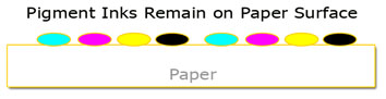
The most significant disadvantages of pigment inks are:
- The large pigment particle size is hard to maintain in solution (pigments want to settle out of solution).
- Because the pigment droplets remain on the surface of the paper, it is hard to produce a high-gloss print and the effect known as metamerism is visible on these papers. (Metamerism will be covered in a future post.)
- Although rapidly improving, the color gamut of pigment inks is smaller than dye inks.
The problem with maintaining these particles in solution is best seen when you compare the relative sizes of dye and pigment particles:
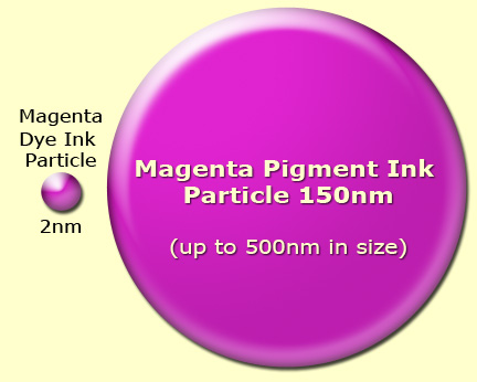
The dye ink particle on the left is small enough (averaging about 2 nanometers in size) to dissolve in the ink's carrier solution (and remain in solution) while the larger pigment particle is difficult to hold in suspension and tends to settle and clump together. It's this clumping and settling that produces the clogging of nozzles that's so frequently discussed on blogs and forums. The big three printer manufacturers, Epson, HP and Canon, have all worked diligently on producing ways of reducing this clumping and clogging tendency on their printers by encapsulating the pigment particles.
Today the situation is much improved. Although head clogging hasn't been eliminated, by carefully following the manufacturer's maintenance suggestions this problem and the associated expense of cleaning (or replacing) printheads can be greatly reduced. As a general "Hub" rule: Pigment printers work most consistently with minimal maintenance issues when used regularly. Working the printer helps keep the pigments in suspension and greatly reduces the probability of excessive settling/clumping.
So, which is best?
There is no single answer for this question. The answer is best found in your requirements. If a large color gamut or high-gloss prints are your primary objectives, then dye inks are an excellent choice.
If long life, permanence and water/humidity resistance are your biggest concerns, then pigment inks are the clear winner. Pigment prints (kept in a photographically safe environment) will have a life expectancy of 4 or 5 times that of dye prints. Current testing done by the Wilhelm Imaging Research organization shows some pigment inks have a 250+ year archival life. To learn more about the specific life expectancy results for any printer you might be considering, check out the test results on the Wilhelm website. It's this long life characteristic that drives many fine art and professional photographers to select pigment ink printers for the prints they sell to make a living.
Note: There's much debate over the validity of print life expectancy testing. Since these tests must be conducted in a lab using accelerated testing methods, some experts dispute the results. However, there is some historic precedence for concluding that prints produced using pigment inks will enjoy an extremely long life. After all, the works of Rembrandt and Leonardo da Vinci were made using pigment-based paints, and they seem to be doing just fine.
Epson, Hewlett Packard and Canon offer dye-based and pigment-based photo printers. Most camera stores will even make sample prints from your digital files to compare results. In this way, you can see the results of dye and pigment inks as well as the capability of different printers. Of course, ask other photographers for their opinion. (We all have opinions on this subject.) Personally, I use three different printers in my iDarkroom. They are all pigment printers.
There is no debate among photographers that ink and paper cost too much. As a life long photographer, I don't see these costs as much more than I experienced with my own traditional "wet" darkroom. (To provide the best images for my customers, I consistently used the best chemistry and paper on the market.) It's part of the cost of doing business.
There are also several manufacturers making their own versions of the manufacturers' original inks for considerably less. Some even sell their inks in bulk ink systems to save the user even more per milliliter. I have seen many tests that indicate these inks do not exhibit the life expectancy or color gamut of the original manufacturers' inks. (I'll probably get lots of email about this.) However, the choice is personal. Only you can decide if any of these 3rd party products are the right choice for your quality needs and financial situation.
For the moment, decide if dye or pigment inks work best for you. And begin your own printer research. If you haven't already guessed, you cannot buy a single printer that uses both dye and pigment inks. It's an "either or" situation. Once you've decided the type of ink you want to use, you will automatically be limited to a line of printers (from each manufacturer) that can accept the ink you've selected. So any printer decision begins with making an ink selection.
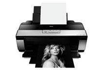
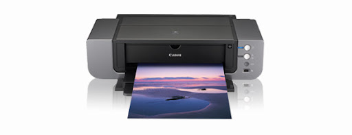
Current Epson 2880, HP B9180 and Canon Pro9500 are today's contenders for "top of the printer pack" in the 13"x19" pigment printer class.
Hope this discussion gives you the basic information needed to select your next printer. If you have any questions or comments, you know where to find me.
Powered by ScribeFire.