About This Digital iDarkroom Primer

This Primer on the new digital darkroom is provided on this blog to arm new DSLR photographers with the fundamental knowledge needed to become familiar with the evolving digital technologies and be able to apply them to their emerging interest in the photographic art. To read this Primer in logical order, please begin with the oldest post and read to the most current. Click HERE for Table of Contents.

Along the way, you'll find, photography tips, photography techniques and an ample dose of solid photo basics to help you feel comfortable in your digital darkroom.

A sister site, Hub's Camera, covers the fundamental mechanics of using your new DSLR camera. Then visit Hub's Photography Tips for basic but essential tips on all things photographic. Links to both of these sites can be found in the right-hand column of this page. Happy shooting!

"Hub's iDarkroom" is a non-commercial, educational service of Hubbard Camera LLC.

Monday, September 15, 2008

Part 11 - Basic Pixels-Per-Inch Considerations for the Printmaker

I've just returned from taking my daughter to college. On the 300 mile return trip, I spent most of my time writing and re-writing this post in my mind. The subject is PPI's (pixels per inch) role in quality image making. I also monitor dozens of Internet forums to "hear" what is most on the minds of iDarkroom beginners. The forum entries on the subject must be in the millions. Nothing seems to create more debate than PPI. Much of the debate could be eliminated if some parameters were placed on the discussion.

So... since this is my blog, I'm making the following assumptions about my readers who are just starting their iDarkroom experience as well as their quality expectations:
  • My readers are taking photographs to 1) produce prints in sizes from 4"x6" to 13"x19" that are viewed at arm's length viewing distances OR 2) to be shared as monitor images (for example, on the Internet, email attachments in digital picture frames, etc.)
  • My readers want to know how to make the best possible printed or monitor images their cameras can produce in their iDarkroom printing environment.
Believe it or not, if you agree that these assumptions represent your photography goals, we've automatically eliminated pages of unnecessary explanation. In fact, these goals are specific enough that I could end this post right now by making the following recommendations:
  • Use a pixel-per-inch setting of 240 PPI for all your serious printmaking.
  • Do not select a PPI setting that causes your computer to interpolate (guess) to produce missing pixels.
  • Use a pixel-per-inch setting of 100 PPI for images targeted for monitor display.
These are my professional recommendations and the guidelines I use every day. If that's all you wanted to hear, no need to read further. (Thanks for stopping by.) If you're a more adventurous iDarkroom beginner, read on to understand my rationale.

This post will look at the basics of PPI as it relates to printmaking in your iDarkroom. Although I will be using Adobe's Photoshop software in these examples, these image controls and decisions are common to virtually all modern digital imaging software.

Let's begin with image definitions for this post:
  • File size refers to 1) the number of bytes of data in the original file captured on your camera and saved on the data card, or 2) the number of bytes in the final image you save on your computer from your digital imaging software. (They are seldom synonymous.)
  • Image size refers to the computer dimensions of the image you see on your monitor (created from the data saved on the camera's data card). This measurement is typically expressed in terms of inches, centimeters, millimeters or pixels/points per inch (PPI).
  • PPI is the number of pixels or points per inch that make up the picture (pixel being a single picture element of image information that is displayed on a monitor or print).
To put these concepts together, consider the following picture:


Hola, Gringo

This picture was taken with a 10 megapixel Nikon D200 and saved in RAW mode. Checking the original file as stored on my data card:
  • The RAW file size is 15.9 megabytes.
  • The dimensions of the image are 2,592 pixels wide by 3,872 pixels tall.
  • The initial resolution of the image is 240 pixels per inch (PPI).
  • The color mode is Adobe RGB (1998).
  • The bit-depth is 16 bit (more on bit depth in later posts).
These are the technical specifications of the image as originally shot and stored by my camera. When this file is opened using the RAW converter in Photoshop, the "Image Size" window can be seen below:


These measurements are now the size of the untouched image in Photoshop. If I were to print this picture without any adjustment, the resulting image would be:
  • 10.8 inches wide
  • 16.133 inches tall
  • with a printer resolution of 240 PPI.
When I save this file ("as is" with no alterations as an uncompressed .psd or .tif file), the saved file size will be 57.4 megabytes (MB). Notice the file size on my data card was 15.9 MB, but now Photoshop indicates the file size is 57.4MB. Some difference. 50% of this file size increase is due to the fact that my camera is shooting in 16-bit mode -- a topic to be discussed in later posts.

Note: Subtracting this 50% for those shooting in 8-bit mode yields a 28.7 megabyte file used in the following examples. This file is derived from the data contained in the image file on your storage card and is the result of red, green and blue information gathered by the 9.6 million effective pixels located on the sensor that collected the light information (times 3 bytes of information per pixel -- one byte each for red, green and blue).

It's at this point that opinions begin to vary regarding print quality. These opinions range from PPI settings of 150 to 600. From my professional experience with modern inkjet printers (and having worked for a printer manufacturer), I believe a PPI setting of 240 is an optimal printer setting. Visually seeing the differences in quality between a print made at 240, 300 or even 600 PPI requires a microscope. Visual differences become more and more apparent as PPI settings lower that 240 are used. So my printmaking is almost exclusively done at 240 PPI.

When I see the image information shown above, I automatically know that the LARGEST print I will make from this file is 10.8" x 16.1". Could I make a print larger than 10.8"x16.1" from this file? Certainly. And I have two methods for making a larger print.

Changing the PPI setting of the image:


Changing the PPI to 150 automatically resizes the picture to 17.28" x 25.81"

As shown in the above Photoshop "image size" window, changing the PPI from 240 to 150 provides a much larger print size while the file size remains the same. However, there are fewer pixels used per inch (90 to be exact) to reproduce each segment of the picture. As a result the printed image will appear softer (lower resolution) than the original 240 ppi print -- when viewed from the same distance. Whether this softer image is acceptable is completely at the discretion of the photographer.

Changing the image size, but not the PPI:


Here the height of the print has been changed to 25", but the resolution remains at 240 PPI

In this example, the linkage between print size and resolution has been broken by asking the computer to "Resample Image" (check box). The new 25" print size was manually entered in the "Height:" box. (Changing the height automatically changes the width proportionally.) The first sign that something unexpected is going to happen is the "new" file size. Making this size change while remaining at 240 PPI has taken the image file size from 28.7 megabytes to a whopping 69 megabytes (see the Pixel Dimension line above).

This window begs the question of "Where does the extra 40.3 megabytes of data come from?" It's a computer guess. A very intelligent guess, but nevertheless a guess. The 40.3 megabytes of new pixel information is determined through a process called interpolation. Using sophisticated and creative computer algorithms, Photoshop looks at the surrounding "real" pixels and produces pixels to "fill in the blanks" that this enlargement request has created. It's statistically unrealistic to assume that these guesses will be true to the original scene. The print resulting from this file will reveal colors, artifacts and detail (or lack of) not present in the original scene. Again, whether this print is acceptable can only be answered by the photographer.

Note: I realize this example is extreme (going from 16" original height to 25" interpolated height. It does, however, make the ramifications of interpolation obvious. Since the typical viewing distance (the distance your friends will stand when looking at your final print) is not much different between a print that's 25" and one that's 16", the effects of 40 million bytes of computer "guesses" will be apparent.

Since I know that something is lost using either method, I remain a purist by sticking with my printer's best resolution (240 PPI) and not allowing interpolation. In this way, I'm assured my print reflects the most technically accurate image my particular camera/printer combination can achieve. That's my goal.

Does this limit my final print sizes? Absolutely. However, since most of my prints are 11"x14" or smaller in size, I'm OK with this limitation. If I need a larger print, I have two choices:
  • accept the quality impact that changing PPI or Image Size produces
  • use a camera with higher resolution (more megapixels).
I have done both although I prefer the second option.

So, if you accept my recommendations (at least while you are starting your iDarkroom journey), here's a small table for determining the minimum number of megapixels required to produce the most popular color print sizes at 240 PPI:
  • 4x6 print = 1.4 megapixels
  • 5x7 print = 2 megapixels
  • 8x10 print = 4.6 megapixels
  • 11x14 print = 8.9 megapixels
  • 16x20 print = 18.4 megapixels
Finally, you can find hundreds of entries in forums around the Internet on this very topic. You've heard my preferences. After taking the time to read various opinions and weighing your options, you will ultimately have to decide the level of image quality that is acceptable in your printmaking.

If you have questions or comments, please let me know.

Wednesday, September 10, 2008

Part 10 - Your iDarkroom Environment

Traditional film-based darkrooms were built to a set of guidelines that provided a physical environment most conducive to performing critical printmaking. The iDarkroom is no different.

As with traditional "wet" darkrooms, our perception of the important elements that make up our images including color, densities, contrast and sharpness are impacted by the very working environment we create when constructing our digital darkroom. This post will discuss how to set up your iDarkoom to minimize external influences that can "trick" your eye and cause disappointing print results.

The overriding objective is to create an area for your workstation and print viewing that is both neutral and representative of the conditions in which your prints will be viewed.

Starting with the room itself, bright colors are OUT. If you visit a traditional professional lab or a newly constructed iDarkroom at a professional imaging service, you are most likely to see white or gray walls with neutral colored flooring. The idea is to introduce NO color that can influence your eye's perception of an image. The walls in my iDarkroom are painted a light gray and the carpeting is a deep shade of gray.

Of course, you'll need light in your iDarkroom. This is a whole other can of worms. Photography is all about light. Working against us is the most amazing photographic device ever conceived -- our eyes. Our eye/mind combination has the exceptional capability to automatically perform color balancing based on the prominent light source. However, in the world of photography, we must be ever mindful of the color of the prevailing light. We often see this color reality on those occasions when a typical household tungsten lamp is turned on in the daytime.


Here's one of those times. Our eyes see the daylight through the window and instantaneously synch all colors in relation to this "known" value. As a result, the light from the tungsten lamp that appears to be white at night is revealed to actually contain much more yellow and red than daylight.

I'm sure you've been in an indoor situation that was lit primarily with standard fluorescent bulbs. You might have noticed that the resulting pictures had a green cast. While you were at the event, everything appeared normal. But your eyes had corrected for the color shift from daylight while your camera told you the "truth". The light is green. So different light sources have their own color characteristics (make up of light frequencies). These differences are expressed in degrees Kelvin. Here are a few examples:
  • The flame from a candle is measured as 1850 to 1930 degrees Kelvin (very yellow).
  • A typical sunset falls into the range of 2,000 to 3,000 degrees Kelvin (still yellow).
  • A household tungsten lamp ranges from 2,500 to 2,900 degrees Kelvin (see picture above).
  • Direct noon sunlight (5,000 to 5,400 Kelvin).
  • Normal daylight-- sun and sky combination (5,500 to 6,500 Kelvin).
  • Outdoor shade areas (7,000 to 8,000 Kelvin) - very blue in color.
This Kelvin temperature reality greatly impacts your choice of iDarkroom lighting since you will be viewing finished prints under that predominant light.


The picture above illustrates the impact of different "white" light sources when viewing a print. This image of a black and white print was taken in the same location as the first picture above. Our eyes know the light source through the window is daylight and have adjusted accordingly. As a result, the right side of the black and white picture is strongly influenced by the light of the tungsten lamp and has a noticeable yellow/red cast. The left side of the picture is being primarily illuminated by the outside daylight and we perceive this part of the black and white print as true black and white.

It's impossible to know all the light sources your prints may be viewed under once they leave your iDarkroom. And you certainly can't afford to make dozens of prints that are color corrected to every possible viewing condition. That's why professionals generally settle on "daylight" as their standard. In the dozens of traditional and digital photographic labs that I have designed and constructed, I have always installed lighting that was balanced to natural daylight. You can too.


My iDarkoom general room lighting is provided by several daylight balanced, 23 watt (equivalent to 100W tungsten) fluorescent bulbs that I purchased at my local Home Depot.

A trip to your local hardware or lighting store is all it takes. Today's highly-publicized fluorescent replacement bulbs can be bought in several flavors. One of those versions is daylight. Expressed in terms of Kelvin degrees, these new bulbs can be found that emit light in the 5,000 degree to 6,000 degree range -- that's daylight. Perfect. At the same time, you gain several non-photographic but important advantages:
  • the bulbs are relatively inexpensive (about $4.00 for a 100 watt equivalent bulb)
  • they generate much less heat
  • they require much less energy to reduce electrical costs
  • they have a life expectancy greater than their tungsten brothers.
Good news all around. My lighting arrangement shields most of the room light from striking my computer monitor screens directly.

How about the workstation area? I apply the same neutral rules. Nothing flashy (colorwise). My furniture is gray and black. The computer counter is a light gray color. And my monitor slides under the workstation's upper bookcases to shield the screen from excessive room light.


One of my digital workstations. This particular workstation contains my trusty iMac, a second monitor to expand my virtual work area, a Wacom tablet for critical Photoshop work and -- of course -- my iTunes controller under the monitor on the right. (Imaging and music just seem to go together.)

I continue the quest for perfect neutrality on my computer monitors. You won't find any psychedelic backgrounds on my monitors' desktops. That would only drive me and my eyes crazy. Instead, as soon as I install any monitor, I first change the background color to -- you guessed it --- a solid middle gray.


The perfect digital imaging canvas -- my desktop

Keep the entire iDarkroom as clean as possible. You'll thank me later.

The one final area of vital importance is your own health. Our perception of colors, densities, etc. are dramatically altered according to our own physical condition. Colors are typically perceived differently early in the morning versus late at night. If you're tired or ill, perception is again affected.

So, stay healthy and have fun with your new craft.

If you have any questions or comments, you know where to find me.

Tuesday, September 9, 2008

Part 9 - Photoshop "Print" Walk Through

The question I am probably most often asked by those setting up their first iDarkroom is: "Could you walk me through the steps for making a print in Photoshop?" This post will cover a typical printing session. However, because of the various versions of Adobe's Photoshop that are being used, the two computer platforms and their operating systems (Mac, PC, OS X, XP, Vista, etc.), and the numerous printers that readers could be using, I cannot cover all of the possibilities. So for this walk through I am using the following:
Although Photoshop is nearly identical on both platforms and the B9180 printing routine is similar to other manufacturers' printers, there are subtle differences. So, the information, screen images and example provided here must be viewed with your specific printing environment in mind and adjusted accordingly.

Shown below is the main Photoshop window displaying the image that will be printed in this walk through:


The following steps are used to send this image to the printer:


1. From the "File" menu, select "Print".

Notice that Photoshop CS3 has eliminated the "Print with Preview" option from the file menu. All printing tasks now take place from the "Print" selection. (For owners of HP's B9180 printer, the HP Pro Print plug-in does not work with Photoshop CS3)


2. Here’s Photoshop CS3’s main “Print” screen.

Below the preview image on this screen is a quick control for changing the orientation of the picture to either vertical or horizontal.

In the “Printer” pull down menu (top of center column) select your printer (in this case the B9180).

“Position” (middle of center column) can be used to customize the location of the image on the printed page. In this example, I've elected to "center" the picture on the page.

Check “Scale to Fit Media” if you want Photoshop to fill the page with your image. This selection is not checked in this example because the print is already sized by the photographer (10x6.6 in.) (Future posts will provide detailed information on sizing images and interpolation issues.)


3. Clicking on the “Page Setup...” button (located in the center column below the "Copies" entry box) in the main print screen above produces this sub-menu to confirm the printer and paper size selection (in this case US Letter size paper will be used). I could also have selected "Borderless 8.5x11 in." to produce a print that covers the entire page and eliminate borders. Double check the "Format for:" box to ensure your printer is selected. The "Orientation" box gives you another opportunity to orientate your image (vertical or horizontal). Finally, the "Scale" entry box on this menu allows you to determine a percentage enlargement. 100% is full size image. Less than 100% reduces the size of the image on the printed page while numbers greater than 100 will enlarge the printed image. (I generally use the sizing boxes on the main print menu to set any scaling options.)


4. After clicking on OK in the Page Setup menu above you are returned to the main print screen.

Notice that the Document Profile being used here is Adobe RGB (1998). This is the color space that was originally set in the camera's menu and subsequently used by Photoshop.

In the “Color Handling” pull down menu select “Photoshop Manages Colors”. This selection tells Photoshop to use the “Printer Profile” we specify in the next step to control the color conversion from Adobe RGB to the profile of the paper being used. Notice the top selection is "Printer Manages Colors". Today's printer manufacturers have developed print drivers with the capability to perform their own profile conversion. Although these drivers are becoming better and better, I normally allow Photoshop to manage the color conversion.


5. Now you need to tell Photoshop which ICC Profile to use by identifying the paper you are using in the “Printer Profile” pull down menu.

In this example, HP Advanced Photo Paper Glossy is being used. When the print instructions are being generated, Photoshop will seek out the ICC profile for this particular paper selection and apply it to the image being printed. Notice that every paper recommended for this printer is listed in this menu. It's apparent that each paper has its own unique printing characteristics that require their own ICC profile.

Some of the paper selections on this menu have been provided by the printer manufacturer and were placed on your computer when you installed the printer's driver software. Other 3rd party papers have been added to this menu. Most 3rd party paper manufacturers' websites provide ICC profiles for their papers to work with your printer. These profiles can be downloaded and added to Photoshop's collection of papers for your printer.

It's not unusual for professional photographers to decide that it's best to create ICC paper profiles specific to their iDarkroom environment. In this case, they use paper profiling equipment and software from companies like X-Rite to generate these unique ICC profiles.


6. Select “Perceptual” from the “Rendering Intent” pull down menu. This is the selection most often used for photographs to produce "natural" colors. Rendering Intent tells Photoshop exactly how colors that are “outside” the printer's gamut are to be brought into the gamut and positioned relative to “in” gamut colors.


7. After selecting the "Rendering Intent", click on the "Print" button (shown on the lower right in the image above). Clicking on the Print button will produce this pop up menu overlaying the main print window.

From the center pull down menu select "Paper: Type/Quality". From the options presented choose: the paper you are using, "Best" for Quality, and -- in the case of the B9180 - choose the paper source. Either "Main tray" or "Specialty Media Tray".

NOW, CLICK ON THE "PRINT" BUTTON. Your printer should start churning out that award-winning print.

Wasn't that easy? Actually, these steps become second nature after a few printing sessions and only take a few moments to complete.

Again, remember this example was specific to HP's B9180 printer. Epson and Canon printing steps are nearly identical but contain some subtle differences. Most companies attempt to help you through the process of making your "first" print with additional educational materials on their website. Here is the link to the listing of these materials on the Epson website. Canon has a similar list of support and instructional materials. Also, Epson, HP and Canon specific blogs are filled with customer experiences for nearly every printer made by these companies. These blogs can provide a wealth of tips for image making from your particular printer.

In any case, these iDarkroom printing steps are much easier, more convenient and safer than constructing a darkroom, mixing chemicals, developing film, drying film, using an enlarger, developing the wet print and drying the print required in traditional film-based photography.

Finally, understanding the steps in this walk through will serve you well regardless of the image editing software or the computer platform you are using. The process is similar for all programs and platforms.

If you have questions or comments, you know where to find me.

Part 8 - Inkjet Printers - Dye vs. Pigment Ink


Just when you think it's safe to go to your photo store and speak "printer-ese", another term and another decision shakes your confidence. Do I buy a printer that uses "dye-based" inks or "pigment-based" inks?

The choice you make does have a significant impact on your image making. Like everything else in photography, there are trade-offs to consider. This post is intended to explain the basic differences between these two ink types and make it easier for you to make your printer purchase.

Background

Dye-based inks have been around in the inkjet printer marketplace since the beginning. The dyes used to produce this ink are derived from vegetable matter that contains the desired color, or they are produced synthetically in the lab. Just as Indians would produce paints from the extracts of plants to add color to fabric, so do modern color scientists develop dyes used to manufacture their inkjet inks.

Dye ink has a clear cut set of advantages:
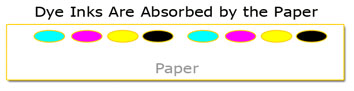
  • The size of the color particle is very small and easily dissolved in solution.
  • The particle size is small enough to penetrate any printing paper.
  • The colors are generally numerous, bright and colorful to provide a broad color range.
  • Because these dyes are absorbed into the printing paper, they provide excellent glossy prints.


Dye inks also have a list of photographic disadvantages:
  • Prints made with dye inks have a shorter life expectancy.
  • Bleeding is a concern (bleeding occurs as a drop of dye ink falls on a piece of paper and begins to expand in size or spread out as the drop is absorbed into the paper).
  • Dye inks are NOT water resistant (much like watercolors in the painting world).

But for many years, dye inks have been the industry standard and have been a major contributor in raising digital photography to an art form.

Pigment inks have been a serious alternative to dye inks for nearly a decade now. Unlike dye inks, pigment inks are derived from ground up minerals. The resulting sizes of the pigment particles are 50 to 250 times larger than dye particles. Although relatively new to the inkjet scene, pigment inks/paints have been used for centuries in the world of art.

As you probably have guessed, there is a list of advantages that pigment inks bring to the photographic table:
  • Pigment inks are very stable and resistant to fading.
  • Pigment ink's resistance to water and moisture is superior.
  • Pigment inks can also produce exceptional black and white prints.

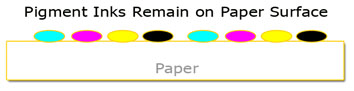
Unlike dye inks, pigment inks are NOT absorbed into the paper. Pigment droplets remain on the paper's surface:


The most significant disadvantages of pigment inks are:
  • The large pigment particle size is hard to maintain in solution (pigments want to settle out of solution).
  • Because the pigment droplets remain on the surface of the paper, it is hard to produce a high-gloss print and the effect known as metamerism is visible on these papers. (Metamerism will be covered in a future post.)
  • Although rapidly improving, the color gamut of pigment inks is smaller than dye inks.

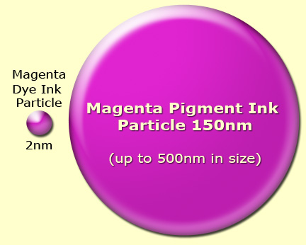
The problem with maintaining these particles in solution is best seen when you compare the relative sizes of dye and pigment particles:


The dye ink particle on the left is small enough (averaging about 2 nanometers in size) to dissolve in the ink's carrier solution (and remain in solution) while the larger pigment particle is difficult to hold in suspension and tends to settle and clump together. It's this clumping and settling that produces the clogging of nozzles that's so frequently discussed on blogs and forums. The big three printer manufacturers, Epson, HP and Canon, have all worked diligently on producing ways of reducing this clumping and clogging tendency on their printers by encapsulating the pigment particles.

Today the situation is much improved. Although head clogging hasn't been eliminated, by carefully following the manufacturer's maintenance suggestions this problem and the associated expense of cleaning (or replacing) printheads can be greatly reduced. As a general "Hub" rule: Pigment printers work most consistently with minimal maintenance issues when used regularly. Working the printer helps keep the pigments in suspension and greatly reduces the probability of excessive settling/clumping.

So, which is best?


There is no single answer for this question. The answer is best found in your requirements. If a large color gamut or high-gloss prints are your primary objectives, then dye inks are an excellent choice.

If long life, permanence and water/humidity resistance are your biggest concerns, then pigment inks are the clear winner. Pigment prints (kept in a photographically safe environment) will have a life expectancy of 4 or 5 times that of dye prints. Current testing done by the Wilhelm Imaging Research organization shows some pigment inks have a 250+ year archival life. To learn more about the specific life expectancy results for any printer you might be considering, check out the test results on the Wilhelm website. It's this long life characteristic that drives many fine art and professional photographers to select pigment ink printers for the prints they sell to make a living.

Note: There's much debate over the validity of print life expectancy testing. Since these tests must be conducted in a lab using accelerated testing methods, some experts dispute the results. However, there is some historic precedence for concluding that prints produced using pigment inks will enjoy an extremely long life. After all, the works of Rembrandt and Leonardo da Vinci were made using pigment-based paints, and they seem to be doing just fine.

Epson, Hewlett Packard and Canon offer dye-based and pigment-based photo printers. Most camera stores will even make sample prints from your digital files to compare results. In this way, you can see the results of dye and pigment inks as well as the capability of different printers. Of course, ask other photographers for their opinion. (We all have opinions on this subject.) Personally, I use three different printers in my iDarkroom. They are all pigment printers.

There is no debate among photographers that ink and paper cost too much. As a life long photographer, I don't see these costs as much more than I experienced with my own traditional "wet" darkroom. (To provide the best images for my customers, I consistently used the best chemistry and paper on the market.) It's part of the cost of doing business.

There are also several manufacturers making their own versions of the manufacturers' original inks for considerably less. Some even sell their inks in bulk ink systems to save the user even more per milliliter. I have seen many tests that indicate these inks do not exhibit the life expectancy or color gamut of the original manufacturers' inks. (I'll probably get lots of email about this.) However, the choice is personal. Only you can decide if any of these 3rd party products are the right choice for your quality needs and financial situation.

For the moment, decide if dye or pigment inks work best for you. And begin your own printer research. If you haven't already guessed, you cannot buy a single printer that uses both dye and pigment inks. It's an "either or" situation. Once you've decided the type of ink you want to use, you will automatically be limited to a line of printers (from each manufacturer) that can accept the ink you've selected. So any printer decision begins with making an ink selection.


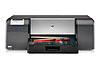
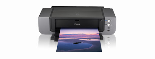
Current Epson 2880, HP B9180 and Canon Pro9500 are today's contenders for "top of the printer pack" in the 13"x19" pigment printer class.

Hope this discussion gives you the basic information needed to select your next printer. If you have any questions or comments, you know where to find me.

Powered by ScribeFire.

Thursday, September 4, 2008

Part 7 - Inkjet Printer Color Primer


At this point, you should understand the variables involved in calibrating the workflow to provide a dependable, color-managed environment. We do this homework and technical preparation to accomplish one thing -- make a print.

As a result, it seems reasonable that before rushing out to buy a printer, we need to understand the photo printer technology that's on the market today. This will be the topic of the next series of iDarkroom posts.

There is a significant difference between the typical inkjet printer used in offices to make copies, send faxes and print emails and the printers which serious amateur and professional photographers choose to make the final print that the world will see.

For all practical purposes, the home iDarkroom enthusiast will select an inkjet printer. Printer manufacturers (for the most part) have focused on inkjet printing as the technology most appropriate to serious photographic printing. This technology has exploded over the past decade to provide printers capable of producing images that rival, and in some cases exceed, the results obtained using traditional photo processing.

All inkjet printers work on the same basic principles. Minute dots of ink are placed in extremely close proximity to each other. In the most basic color inkjet printers, these dots are either cyan, magenta, yellow or black. In more advanced printers, additional colors of ink are incorporated to improve the overall color gamut of the printer (always trying to enlarge the gamut to come closer to the gamut of the camera). Colors of ink most typically added to inkjet printers are light cyan, light magenta, shades of gray, and occasionally a red, green and/or blue.

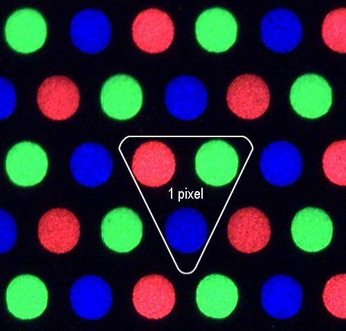
You see the magic and the technology at work when you look at a TV or monitor through a simple magnifying glass. The monitor (close up) is made up of millions of colored elements. In the case of the TV or monitor, these elements are either red, green or blue (the real primary colors). A photographic pixel is represented by one each red, green and blue element. For each frame of the image you see on TV, the elements that represent the colors in the scene are switched on. Depending on how many elements of a single color are turned on in a specific area, and which elements are turned on in the surrounding area of the scene, determines the detail and the color perceived.


Close up of red, green and blue elements in a white area of a scene.
(from Accurate Image Manipulation by Timo Autiokari)

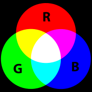
Because the elements are far too small for our eyes to detect individually, we perceive masses of elements. This mass (depending on which pixels are turned on) is seen as a particular shade of color. Look at the simplest example first. If only the red pixels were turned on, we would see the color red over the entire screen, of course. The same is true for green and blue. But what if all of the red elements and all of the blue elements were turned on? What color would we see on the screen? The answer is magenta (a purple-pinkish color). The same example but with only red and green elements would yield the color yellow, while 50% green and 50% blue elements would be perceived as the color cyan (sort of a turquoise color). If all elements are turned on (red, green and blue), what color would you see? If all the pixels are turned off, what color would you see? Right, black (or no color). With millions of pixels on your TV and monitor, it's possible to create virtually every color under the rainbow by selectively mixing the pixels that are "on" and "off" in relation to their neighboring pixels.

Printers work in exactly the same fashion. But instead of using the primary colors (red, green, and blue), printers use the secondary colored inks (cyan, magenta and yellow). So, what about the black cartridge in my printer? Well, in theory, the combining of cyan, magenta and yellow ink produces the color black. However, in the real world of ink and paper, combining the secondaries in equal proportions produces "mud" (a dirty dark brown). So, a black ink cartridge is added to the mix to produce a true black on paper. Second trick question. If combining cyan, magenta and yellow produces (in theory) the color black, how is the color white produced on an inkjet printer?

The answer is: It isn't.

The paper is white. So, the absence of any cyan, magenta, or yellow ink means no ink is placed on the paper, and we see that lack of ink as the white of the paper. Naturally. This is true for traditional photo processing as well. Anytime white appears in a picture, it's actually the base (white paper) that's being seen.


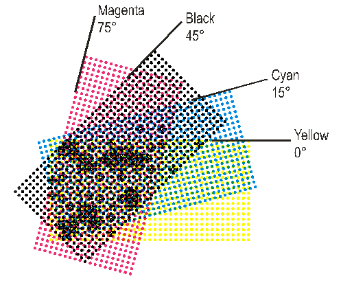
This graphic shows the cyan, magenta, yellow and black dots that create the image and colors in an inkjet print. Notice the colors overlap to produce their primary cousins (red, green and blue).


Color Imaging Math

Using the Primary Color Pallet (Red, Green and Blue)
Often referred to as RGB or Additive Color. Remember Adobe RGB?

  • Red+Blue = Magenta
  • Red+Green = Yellow
  • Green+Blue = Cyan
  • Red+Blue+Green = White

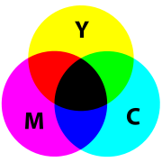
Using the Secondary Colors (Cyan, Magenta, Yellow)
Often referred to a CMYK or Subtractive printing (K stands for the extra black ink that's included in the printing system)

  • Cyan+Magenta = Blue
  • Cyan+Yellow = Green
  • Yellow+Magenta = Red
  • Cyan+Magenta+Yellow = Black

By using all the colors of the primary OR secondary color pallets in VARYING amounts all colors can be reproduced.


Here's the color wheel that photographers and photofinishers have used for centuries. From this graphic, the relationship of the primaries or additives can be seen where the red, green and blue circles overlap to produce the secondary colors -- cyan, magenta, yellow -- and finally white where all three colors intersect.


This is the color wheel that traditional press printers (i.e. commercial offset presses and inkjet printers) use to explain the relationship of the secondary or subtractive colors -- cyan, magenta, yellow. These colors overlap to produce the red, green and blue primaries as well as the color black where they all intersect.

As with other topics discussed in this series of posts for the beginning iDarkroom enthusiast, there is much more to the subject of color reproduction. But a solid understanding of these fundamental concepts will serve you well for making your first quality inkjet prints.

The next post will continue the inkjet printer discussion with the basics of Dye and Pigment inks. The decision as to whether you will use Dye inks or Pigment inks plays a major role in your printer purchase.

I hope this first basic inkjet printing post has been easy to follow. If you have any questions or comments, you know where to find me.

Powered by ScribeFire.