About This Digital iDarkroom Primer

This Primer on the new digital darkroom is provided on this blog to arm new DSLR photographers with the fundamental knowledge needed to become familiar with the evolving digital technologies and be able to apply them to their emerging interest in the photographic art. To read this Primer in logical order, please begin with the oldest post and read to the most current. Click HERE for Table of Contents.

Along the way, you'll find, photography tips, photography techniques and an ample dose of solid photo basics to help you feel comfortable in your digital darkroom.

A sister site, Hub's Camera, covers the fundamental mechanics of using your new DSLR camera. Then visit Hub's Photography Tips for basic but essential tips on all things photographic. Links to both of these sites can be found in the right-hand column of this page. Happy shooting!

"Hub's iDarkroom" is a non-commercial, educational service of Hubbard Camera LLC.

Friday, July 31, 2009

See Hub's Images They Way They Were Intended - In Print


I'm frequently asked if the images I use in my educational blogs and live classes can be purchased. I have resisted selling my images because I was concerned about affordability. I print all my images. Consequently each print is expensive, exacting and intended to meet the standards of a gallery print. As a result, the cost of prints might be out of reach for the readers I attempt to help in my digital photography blogs.

I recently discovered a solution that makes it possible to provide an economical way for students to see my images in a larger print form and also allow the modest collector a convenient way of purchasing fine art prints. The result is a professionally printed catalog, Hub's Imagery - By Popular Demand, containing enlarged versions of 21 of my most often requested and favorite images. The catalog cost less than $20. For those interested in owning any of my fine art images, the catalog also contains details for ordering individual prints on-line.

If you are interested in learning more, seeing a catalog preview or ordering the catalog, click here. I hope you will enjoy this series of images as much as I enjoyed putting the catalog together.

Sunday, June 7, 2009

Part 24b - White Balancing in the iDarkroom

In Part 24a - White Balancing in the iDarkroom, the concepts of "neutrality" in color and "known reference" were explained. Pretty exciting stuff. Right? If you have not read Part 24a, take the time now. It will make this discussion much easier to follow and understand.

Using these concepts, it's possible to apply white balancing in the iDarkroom to control precisely the color rendition of any image. Precise color in photographic terms means that colors in the print or on the monitor appear just as they would if seen under standard sunlight conditions.

In terms of "neutrality", when a true gray object is viewed under normal sunlit conditions, the individual Red, Green and Blue values are identical. If they are not the same, then the gray object exhibits a color bias or "tint". The object of white balancing is to adjust the individual RGB color values of the known neutral reference until all three colors have the same numeric values -- a true gray.

When we allow the computer to adjust a "known reference" to its neutral values, our imaging software can automatically apply this same numeric color correction to every pixel in the image. Like magic, the entire image becomes color balanced based on one "known reference".

But there are almost "known references" and then there are real "known references". This would be a good time for some examples and some helpful pictures.

(Blog pictures can appear small. Clicking on any of the following images will produce a larger version to save your eyesight.)

An "almost" known reference


Figure 1 - Camera white balance set to daylight, light source incandescent table lamp

The Figure 1 image was taken with a DSLR set on a white balance of "daylight". However, the light source was a table lamp using a standard incandescent light bulb. The result is a picture containing far too much yellow. We'll correct the color rendition in post processing using both Photoshop and Lightroom 2. But to make the needed correction, a "known reference" point is required. A point in this picture where we know the color should be a true neutral (where the red, green and blue values are equal).

We learned in Part 24a that all true shades of gray from pitch black to pure white have red, green and blue values that are equal. Our first task is to find a neutral color in this picture. This is tough, but there is one small area that appears to be a very bright white.


Figure 2 -- "Almost" known reference shown in yellow circle

The small area of the decorative ball shown in the yellow circle of Figure 2 appears to be made of white thread. That's a good thing. Photoshop can use this as a reference point. And here's how.


Figure 3 -- Using Photoshop's "Levels" command to adjust white balance.

Figure 3 shows our picture in Photoshop with the "Levels" command window open. Below the "Options" button are 3 eyedropper icons. These are the tools for color balancing. The three droppers from left to right are black, gray and white. The dropper selected is determined by the area chosen as the known reference. In this case, I selected the white eye dropper (inside the green circle) because I will be applying the color correction adjustment to a known white reference point in the picture.

I click on the white eye dropper to select it. Then I click on my known white reference (the white thread inside the red circle in Figure 3). Zap. It's done. Not only was my white reference point corrected to a neutral white, but every other pixel that makes up this image was automatically adjusted with the same color correction. Compare the color in Figures 2 and 3. Lightroom has a similar "eye dropper" white balance tool.

So that's it? If only it were that simple.

Remember, I said this is an "almost" known reference example. It works, and I use it frequently. It's a "good enough" solution for most situations. But, it is not an exact white balance color correction.

The reason is because the thread in this picture -- like every other color that we perceive as neutral -- isn't exactly neutral. If we could analyze the color of the thread that was used as our white balance reference point, it would not be a true neutral white. It would have some color bias (or tint). So, when I corrected the thread to a true neutral white with the "eye dropper" tool, I forced it to become a white that wasn't true to the real world color of the thread. For many, this is good enough.

A "Real" known reference

When color rendition is critical, there is a simple solution. A solution that has been used by photographers for decades. PLACE A KNOWN REFERENCE IN THE PICTURE.


Figure 4 - Kodak Color Control Patches Chart

All we need is something we can place in the frame of the picture that we know is absolutely accurate in color. Figure 4 shows one of these standards. This Kodak Color Control Patch chart contains colors of known color values. The black, gray and white on this chart are totally neutral. They are our "known references". If we could "eye dropper" one of these colors in Photoshop or Lightroom, then correct white balance would be assured.


Figure 5 - Original picture with Kodak reference chart included

Figure 5 shows the original picture again. Only this time the Kodak chart has been added to the scene. (I know. Having the chart in the picture isn't something most people would want to frame and hang in their living rooms. I'll take care of that issue later.) But the picture now contains a white that we know is truly white in reality.

Note: The Kodak chart shown here is only one type of reference that can be bought at your local camera shop. Many photographers use a commercially produced gray card. This 8 inch by 10 inch card is a single solid 18% gray in color on one side and pure white on the other side. For white balancing, either type of card works well. Remember to use the appropriate "eye dropper" tool when white balancing in Photoshop.

However, one complicating factor to our white balancing process by using this reference card is that WE DON'T WANT THE CARD TO APPEAR IN OUR FINAL PICTURE. So, when taking the picture in Figure 5, take a second picture with the reference card REMOVED. The plan is to correct the picture with the reference card to a perfect white balance, and THEN apply the same correction to our second picture with the card removed. But, how is this done?


Figure 6 - Create a "Levels" adjustment layer

Once the picture with the reference card is opened in Photoshop, create a new "levels" adjustment layer as shown in Figure 6.


Figure 7 - Making the white balance correction using a "levels" adjustment layer

Figure 7 shows how this white balance correction is made.
  • from the "layers" window (green box) select the new adjustment layer (yellow box);
  • from the "adjustments" window (blue box), select the white "eye dropper" (magenta box);
  • click the "eye dropper" on the white patch of the Kodak reference chart in the picture (red circle).
The entire picture changes in color to reflect the correction needed to make the white Kodak patch a true white. Now we have a picture of the decorative balls with a Kodak reference chart that is color accurate and suitable for framing.


Figure 8 - Applying white balance correction to the final picture

Figure 8 shows how the corrections we just made can be applied to the picture with the Kodak chart removed. After all, this second picture should require exactly the same correction.
  • Start by opening both pictures in Photoshop and place them side-by-side.
  • Make the active window the corrected picture containing the Kodak chart (the green box shows that this is the active window).
  • The layers window (I placed it between the two pictures for this example.) shows two layers. One called "background", and one labeled "levels 1". Click and hold on the "levels 1" layer.
  • Drag the "level 1" layers (shown as the red box above) to the second picture (without the Kodak chart) and release the mouse button.
  • Photoshop will automatically make a copy of the adjustment layer from the first picture and create an exact adjustment layer in the second picture. And the color will change to match our first, white balance corrected picture.

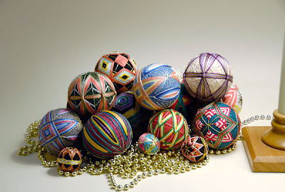
Figure 9 -- Final "real" known reference" white balanced image


Compare the final picture in Figure 3 using the "almost" known reference to the final "real" known reference picture in Figure 9 above.

Lightroom uses a similar "eye dropper" technique, but requires fewer steps.


Figure 10 -- Lightroom 2 White Balance Tool

White balancing is done in the Develop module of Lightroom 2.
  • click once on Lightroom's white balance "eye dropper" tool (red circle in Figure 10);
  • find the known neutral reference point in the picture and click once (shown in the green circle of Figure 10).
Then all colors within the picture will change based on the correction required to make the reference point neutral. Figure 11, below, shows the results of this white balance procedure.


Figure 11 - Original image after applying the white balance tool

Applying this correction to the picture without the reference chart is even easier. As a matter of fact, this correction can be applied to multiple pictures at the same time in one quick step.


Figure 12 - Applying one correction to multiple images in Lightroom

In the Library mode, shown above in Figure 12:
  • click-select the picture that has the correction you want to apply to other pictures in the collection (shown in the green box);
  • while holding down the Alt key on PCs or the Command key on Macs, click-select all the images to which you want to apply the same white balance correction as the original;
  • click on the "Synch Settings" button (shown in red circle in Figure 12).

The window below will appear:


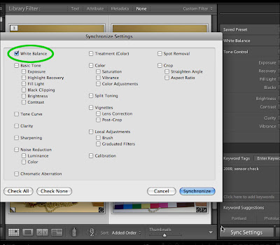
Figure 13 - Lightroom "Synchronize Settings" window

The window that appears (Figure 13) allows the synchronization of dozens of image attributes. But only the white balance correction will be selected for this example. Only the White Balance box (shown in green) should contain a check mark -- all others blank. Then click on the Synchronize button in the lower right-hand corner.


Figure 14 - White Balance of master image is applied to all selected images.

Figure 14 shows the results of synchronizing the white balance of the four images. Lightroom's Synchronize feature allows for rapid duplication of any of the program's editing features to other pictures in the collection.

Note: Applying a white balance correction to multiple images ONLY works when all the pictures were taken under the SAME light source.

Considering the wealth of white balance controls available on modern DSLRs when the picture is being taken and the additional controls available in image editing software during post processing, there is little excuse remaining for poor color accuracy. Take advantage of all these controls to provide the color accuracy and creativity your vision of the final picture requires.

Tuesday, May 12, 2009

Part 24a - White Balancing in the iDarkroom

In my blog for beginning DSLR camera users, Hub's Camera, the topic of setting the proper white balance was the subject of a three part post (Parts 24a, 24b and 24c). It is also possible to correct an image's white balance in the digital darkroom after the picture has been taken. Regardless of whether you decide to address the issue of white balance when taking the picture or later in your computer as a "post processing" procedure, white balance is critical to the accurate rendition of colors in the final picture.


Figure 1, A classic white balance situation

Figure 1 illustrates the white balance problem faced by photographers in different light source situations. The image on top was taken with the camera set to "daylight" white balance. The colors in this picture have a definite yellow and red cast. This result is to be expected since the predominant light source for this picture was a table lamp with a standard tungsten light bulb.

The lower picture in Figure 1 appears more "normal" to our eyes. The whites are white. The blacks are black. And all the other colors are very close to the originals. To accomplish correct color rendering, the camera was set to a white balance of "tungsten". With the white balance settings on "tungsten", the camera automatically applied adjustments to make the final image look "normal" -- as it would appear under natural sunlight conditions.

So, that works pretty well. But what about the times when:
  • a photographer forgets to change the white balance settings in the camera, or
  • the available light source isn't quite a match for any of the camera's built-in white balance controls, or
  • the photographer needs to further refine the white balance of an image for precise color rendition?
Is there no hope? Sure there is. That's when you step in with your newly-acquired iDarkoom skills.

This is the first of a two-part discussion on White Balancing a picture after it has been taken using a digital imaging program. I will present the underlying principles that determine proper light balance. Understanding white balance requires an understanding of neutrality and a known point of reference. Sounds technical, but it's really common sense explained using a little technical background information.

Photography is a Red, Green and Blue world -- the world of primary colors. Using these primary colors we can reproduce all the colors we see in the real world every day. We can accomplish this because digital photography allows us to control the amount of red, green and blue that makes up each and every point of color in our final pictures. Every point of color in a picture is expressed as a specific amount of red, green and blue, in increments up to 256 for each color.

To illustrate this concept, hit the play button on the video screen below.


Figure 2 - RGB video

I know. I know. I'm no James Earl Jones. But I hope the information shown in the Figure 2 video helps you understand how all the colors of the rainbow can be re-created in photography by using only three primaries -- red, green and blue.


Figure 3 - Neutral Gray numeric values

Most importantly for our discussion of white balance correction, let's look at the concept of a "neutral" gray. A neutral gray has no color bias. A true neutral gray of any density contains numerically equal amounts of red, green and blue as shown in the Info screen in Figure 3.

Why is neutral gray so important? Glad you asked. In reality, there are few colors in a real photograph that we can identify by their RGB numeric values. Agree? When you take a picture of a red flower, do you absolutely know the R, G and B numeric values of that flower's red coloring? No. It's impossible without carrying around a scientific color measuring device in your camera bag. Let's not do that.

There is a component within a picture about which we do know some facts that will allow you to correctly color balance your image. That's the colors black, white and all the grays in between. We KNOW that if these "colors" are reproduced accurately then the Red, Green and Blue numeric components will be identical. If you can identify a white or gray in a picture, you have found a "known reference". That's a point of reference that can be used to white balance your picture and render the final image as it would appear under normal daylight lighting.

Then all we have to do is apply photography's best kept secret. If you can correct that shade of gray to a true neutral (where RGB values are identical) and change ALL remaining colors by the same amount, every color in the picture will be rendered correctly. Remember: When you identify a "known reference" and adjust that one color (gray) to neutral, then all the other colors will look correct.

Part 24b will discuss the tools that software programs like Photoshop and Lightroom 2 provide to make this critical white balance correction. You've already done the hard work by working your way through this post. The actual adjustments you will learn in Part 24b are easy.

Saturday, April 18, 2009

Part 23 - Creating a Copyright Notice

With so many images being displayed and shared on the Internet, theft is a major concern of photographers. The concern is justified. Photographers' images are innocently or deliberately stolen thousands of times everyday in cyberspace. One method of making theft less attractive and more difficult is the application of a copyright mark to monitor-displayed and printed images.

This blog post will provide you with an easy method of creating and applying simple copyright marks to your images.

Before beginning, there is one fact that every photographer must face. If you place an image on the Internet and someone wants to steal the picture, it WILL be stolen -- no matter what copyright precautions have been taken. The only guaranteed way of protecting your images from Internet theft is to NOT place them on the Internet.

The first step in producing a copyright mark is to create a blank image in your digital imaging software program. (For this exercise, Photoshop will be used. Other imaging programs will work in a similar fashion.) We are making a master copyright image that will be used every time a copyright mark is applied to a new photograph. This document is being created with a BLACK background at 600 ppi by 800 ppi at a resolution of 72 ppi for display on the Internet.

On this blank image, the TEXT tool will be used to create a new layer that contains the content of our copyright.

Figure 1. Text applied in separate layer

In Figure 1, WHITE text for the copyright has been added to a new layer above the black background. The placement and exact size of the text is not important at this time. Pick a text size that you can easily see and edit. Final sizing and positioning will be determined when the copyright is applied to the final image. Save this file with a unique name and in a permanent safe location. Make certain you save this file with the layers intact. In Photoshop jargon, this means don't flatten the image, and save it as a TIFF or PSD file. You will use this copyright master file frequently.

While we're at it, let's produce another master file using black text on a white background. This will give us two color options for our copyright mark -- white text to be used on dark backgrounds and black text for light picture backgrounds.

Figure 2. Adding black copyright text to a white background master.

Follow the same steps shown above, but this time make the background white and the text color black. The finished digital image is seen in Figure 2. Save this file with a descriptive title.

It's time to add this copyright to a priceless Hub original.

Figure 3. Original picture and copyright files open.

Figure 3 shows the Photoshop workspace with the image requiring the copyright mark on the left and our prepared copyright text image on the right. On the far right is the "layers" window. Begin by clicking on the copyright image to make it the active window (outline in yellow above). Notice the "layers" window indicates two layers -- background layer and the text layer outlined in red.

Figure 4. Moving the copyright layer to the new image.

Now for the fun part. Click and hold on the layer containing the copyright TEXT. While holding the mouse button down, drag the text layer to the picture on the left in Figure 4.

Figure 5. Text layer applied to original photograph.

The original photograph will now look like Figure 5 with the copyright text now applied as a new layer above the image. It worked. But it's not in a very aesthetic position on the picture.

Figure 6. Final copyright placement.

Using the "move" tool (shown in the red circle in Figure 6) and the text layer selected, the copyright can be moved (dragged) to its final location on the picture. The white text copyright mark was selected for this picture to stand out against the gray background.

Figure 7. Scaling the text to the picture.

Using the "Scale image" function in Photoshop and the text layer selected, the text size can be altered to suit the photographer's taste. (see Figure 7) This copyright will suffice, but I find it visually distracting. I prefer a semi-transparent watermark to allow the background image to be seen.

Figure 8. Changing the copyright text transparency.

In Figure 8, the copyright text layer has been selected. The "opacity" control above the text layer has been changed to 50% to allow the background image to be seen through the white text.

Figure 9. Final image with copyright as it would appear on the internet.

Figure 9 shows the final Internet-ready image. Figure 10 (below) used the same procedure to apply the black copyright text to a light background image. Notice that a 50% transparency has also been applied to this text.

Figure 10. Black text copyright notice on a light colored background.

Both of these images required "flattening" of the layers and saving as JPEG files for Internet use.

Some final notes:
  • Be careful not to overwrite your original image file. Save this file under a new name.
  • Once the master copyright files have been created and saved, applying the notice to your images in the future will require only a few seconds of your time.
  • When sizing your copyright text on the final picture, keep it unobtrusive.
  • The metadata that's attached to your original file will provide additional proof of your ownership.
  • This example is intended specifically for 72 ppi images used on the Internet. I also add a copyright mark to images I print. Since I normally print at 240 ppi, I have created a white and a black text master copyright file for this ppi. I then apply my copyright notice to these print images using the same steps as above.

Monday, March 16, 2009

Part 22 - Preserving Your Digital Image Files

It has been said that today's digital image files may have a shorter life expectancy than traditional film due to the limitations of digital storage technology. For example, the negatives from the black & white or color film your dad took of you as a child will probably out live the CD you just created for back up. As you become more accomplished in photography and the iDarkroom, the inevitable result will be an ever increasing number of priceless files that make up your personal collection. To you and your family, these files are irreplaceable.

There is an organization that provides the public with the latest information in storage technology. The International Imaging Industry Association, I3A, is the leading imaging industry trade association. Its members are experts in setting standards, providing education, and supporting safe environmental practices for the photographic and mobile imaging markets. The goal of I3A is to find common ground for advancing the industry, and to enable better products and services for its customers.

On the I3A's educational website, SaveMyMemories.org, a step-by-step guide for archiving digital files using the latest available options is provided to the public. Bookmark this site. Use the information they provide to help you choose the best possible back up methodology to store your irreplaceable creative and family image files.

Then, from time to time, check back in to see what new long-term data storage technologies, products and recommendations have been introduced that might further increase the life expectancy of your images.