About This Digital iDarkroom Primer

This Primer on the new digital darkroom is provided on this blog to arm new DSLR photographers with the fundamental knowledge needed to become familiar with the evolving digital technologies and be able to apply them to their emerging interest in the photographic art. To read this Primer in logical order, please begin with the oldest post and read to the most current. Click HERE for Table of Contents.

Along the way, you'll find, photography tips, photography techniques and an ample dose of solid photo basics to help you feel comfortable in your digital darkroom.

A sister site, Hub's Camera, covers the fundamental mechanics of using your new DSLR camera. Then visit Hub's Photography Tips for basic but essential tips on all things photographic. Links to both of these sites can be found in the right-hand column of this page. Happy shooting!

"Hub's iDarkroom" is a non-commercial, educational service of Hubbard Camera LLC.

Monday, August 11, 2008

Part 3 - Worlds of Color

To our mix of variables that the photographer must consider, I will now add another.

In the iDarkroom there are several “worlds” of color. It's these multiple worlds of color that cause the confusion and misconceptions about reality that plague photographers. The color worlds that most immediately impact the results of your photography are represented by the globes below:


This globe illustrates all the colors (color space) the human eye is capable of recognizing.

This globe shows the color space that your computer monitor is able to display.

Finally, this globe represents the color space that a typical color photographic ink jet printer can reproduce.

These globes contain all the colors that our eyes, computer monitor and color printer can recognize or reproduce. At first glance, the natural tendency is to believe that all three worlds are the same, and that each device recognizes and reproduces the same colors.

It's not going to be that easy. In reality, the size of these three color worlds is significantly different. Although simplistic, the picture below is a more understandable representation of the volume of colors in each world:


As this graphic illustrates, neither a computer monitor nor a photo printer have the color range of the human eye. In fact, the photo printer has a color world that’s smaller than the computer display. In photo jargon, these worlds are known as color gamuts. Each input and output device in a photographic system has its own color gamut.

So, although all three color gamuts contain red (for example), the "Human Eye" is capable of recognizing more "shades" and "densities" of red than either the monitor or printer are able to reproduce. It doesn't take a rocket scientist to see the photographer's dilemma. "If the last component in the photographic system (the printer) is not capable of reproducing all the colors that my eye can see, then how can any final picture be true to reality?" The short answer is: The final picture is rarely a perfect match to reality.

But, by understanding these color space differences and accepting some compromises, as well as taking the necessary steps to calibrate and synchronize all the devices in the entire process, incredible images can be created. (Remember the airplane monitors: they were all trying to display the same images in the same color space, but they were not calibrated or synchronized. As a result, they all displayed color differently.)

Let’s start by giving you a look at the real gamuts in our photographic system. In this example, I have selected the Adobe RGB space option on my digital camera. Shown below are all the colors (or gamut) of this color space. All pictures taken with this camera will be translated to fit within this Adobe color space:


The Adobe RGB (1998) color space is displayed here using Apple Computer's Color Synch® utility program that is included on Apple Macintosh® computers.

Although no industry standard has been declared, Adobe RGB (1998)® is probably the most common and one of the larger color spaces commonly used in photographic applications. I recommend using this space as your starting point for learning the ins and outs of color management.

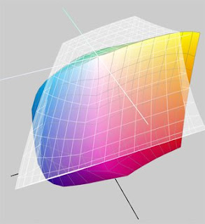
Now we know the color space of our camera (Adobe RGB 1998). How do monitors and printers relate to this color space? The Color Synch® utility included with Macintosh® computers provides a visual comparison of these color spaces. Take a moment to study the 4 comparisons shown below. The problem of color matching and color management becomes immediately apparent.

I am using a Hewlett Packard Photosmart Pro B9180 13" printer in these color space comparisons. Similar graphs would be seen with comparable printers from other companies like Epson and Canon.

Knowing that these differences in color spaces between the components of your photographic system exist is the first step towards managing your color environment and achieving the results you are expecting.


A) Apple iMac Monitor Color space compared to the Adobe RGB color space (white wire frame). Notice the Monitor's Color Space fits within the Adobe RGB space and is not capable of displaying the entire Adobe RGB space.


B) HP’s Pro B9180 printer color space compared to the Adobe RGB color space (white wire frame graph). The printer is not capable of printing all the colors contained in the Adobe RGB color space. In addition, the printer is capable of producing colors that are outside the Adobe RGB space (see yellow and orange segments that extend beyond the Adobe space.)


C) HP’s Pro B9180 printer color space compared to the iMAC monitor color space (white wire frame graph). The differences are again apparent between these two devices. Each space contains colors that the other cannot replicate.
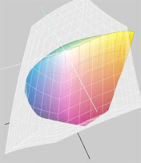


D) Finally, HP’s Pro B9180 printer color space compared to the Adobe RGB color space. This comparison is identical to the graphic in figure B above. The difference is that the top image is the printer’s color space when using glossy paper while this image is the printer’s color space when printing on a matte fine-art paper. Yes, to add yet another variable, the paper you use in your printer makes a difference as well.


Understanding the color spaces that these photographic devices are capable of reproducing is critical. To ensure that these unique sets of colors are accurately produced, each device must be calibrated.

And, calibration is where the next post will begin. Hang in there. It will all come together, and you'll be the master of your iDarkroom domain.

Note: Apple Macintosh® computers and Apple Computer's Color Synch® utility were used in this discussion for illustration purposes. These color space issues are identical on PCs as well.

Part 2 - Variables, Variables, Variables

Getting Started

Understanding the monitor experience encountered on my cross-country flight, what are the odds that your computer monitor is accurately displaying the images you painstakingly labored over in the field? Answer: slim to none.

Now assume color printers have their own unique set of color rendering issues. They do. And located before the monitor or printer is the camera itself. Do all cameras sense color and density exactly the same? Do all digital cameras have the same capabilities to capture a scene? Nope.

Then there's the computer and the image editing software that makes up your iDarkroom. Two more chances for color matching problems.

Finally, add the most variable of the variables -- the photographer. Among these personal variables are eyes, age, sex, memory, mood, sense of humor, what you had for dinner last night and what side of the bed you got up on this morning. All of these factors, and many more, continually impact a photographer’s perception of the scene being shot and the resulting picture.

When I owned a professional processing lab, I had one professional photographer who was very loyal but also very demanding about the way his images were printed. I paid particular attention to his work as it passed through the lab. Keeping George happy not only meant a steady flow of work, but also provided an excellent reference for other professionals considering my lab. I posted several prints that he had previously approved to use as guides as we printed his images.

On one occasion, he dropped off a wedding assignment for 50 8”x10” color prints. He needed the prints in 3 days. No problem. I reviewed each print as it was being processed to ensure the prints matched his normal taste and technical requirements. The job was done by the end of the second day.

On the third day, George arrived early in the morning to pick up his job. From the time he entered the lab, George didn’t seem quite his usual self. I handed him his prints. He was not pleased, and proceeded to reject virtually every print for a multitude of reasons. He said he absolutely needed the completed job by the next day. I told him we would apply the corrections he had provided and have the prints ready by noon of the following day.

George arrived the next afternoon, and I gave him the prints for review. I watched nervously as he shuffled through the prints. His evaluation was glowing, “Excellent" he said, "Now this is just what I wanted. Did you see the difference when you were reprinting the order? I knew you could do better.”

So what did I do to ensure that his prints were correct and delivered on time? Nothing.

When George first reviewed his prints, it was obvious that he was not feeling well. I also knew the prints we had made were very good. After he left the lab, I repackaged the job and set it aside. The next day I presented him the same set of prints that he had rejected 24 hours earlier. Today, they looked fine.

As it turned out, I spoke with George’s wife a day or two after this episode. Sure enough. George had been ill and didn’t sleep well the night before coming to the lab. The combination of no sleep and reviewing the prints very early in the morning had altered his perception of what he was seeing. The next day he felt better, got a good night’s sleep and picked up his order in the afternoon. He had a completely different mental and physical perception of the prints he was evaluating. (By the way, I confessed to George about two years later when he was in a very festive mood.)

The point is: Photography is a magnet for variables, and the most unpredictable of these is the photographer.

Yet photographers continue to believe that purchasing expensive equipment will automatically result in pictures that are accurate reproductions of what they saw. The most important ramification of this logic is that if pictures are not accurate or of poor quality, it’s too often assumed the fault lies with the equipment and the manufacturer. The more likely truths are that:

  • the photographer’s memory of the colors and densities that made up the image have been clouded by subjective or emotional realities of the event, or
  • the photographer’s color management environment is entirely out of synch.

I can’t do much for the first possibility except to say, “Stay healthy and try to be as technically accurate as possible when taking photographs.” Know that there’s a difference between what you saw and what you thought you saw. The magic of digital photography is that if you capture a technically accurate exposure, the image you take can be digitally enhanced to come very close to what you thought you saw. The resulting photograph is your vision.

On the other hand, understanding the fundamentals of color management will greatly enhance your ability to produce a final print that matches your vision. As complicated as this may sound, the following posts will provide the color management basics most critical to your photography.

We'll begin with a look at the various color worlds (gamuts) that you must consider every time you enter the iDarkroom.

Part 1 - What's The Big Deal About Managing Color In Photography?

My many flights from Portland, Oregon to New York City are always too long, too cramped and a culinary nightmare. On a recent flight, I was pondering the nutritional value as well as the airline’s hefty investment in the bag of peanuts I was unceremoniously served, when a fellow airline victim noticed my camera bag wedged under the seat in front of me – leaving zero room for my size 12 feet. He asked if I was a photographer and said that photography was his passion and hobby. Our discussion soon came to the topic of color management. His first comment was, “What’s the big deal about color management? Color is color. It's all taken care of at the factory.”

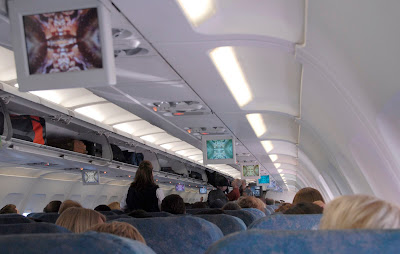
Groping for a simple, practical answer, it occurred to me that we were sitting in the middle of the latest “Die Hard” movie. The plane’s cabin had been magically transformed into a movie theater with Bruce Willis performing for all of us on about 20 small LCD monitors hanging from the ceiling. (see picture below)

I pointed to the dozen or so monitors in front of us. Each monitor was identical. Each monitor was made by the same manufacturer. Each was showing the same movie from the same DVD on the same digital player at the front of the airplane. Yet no two monitors looked the same. One monitor had a magenta cast, another yellow, another green and so on until one monitor had actually lost all of its color and was displaying a black and white version of the movie. I said to my new photographer friend, “There’s the problem."


Color management is a very big deal if you're serious about photography. The next post will explain the problem demonstrated by my favorite airline in the picture above. The fact facing every iDarkroom technician (you) is that if color management issues are ignored, there is virtually NO WAY that the image on your monitor will ever match the print from your printer. These frustrations are surmountable. Creating that "comfort factor" is the goal of these color management posts.